Boulder-area artist Teresa Booth Brown is best known for her non-objective paintings, but for this impressive solo at Ironton, she decided to do something different by presenting her distinct, if conceptually related, drawings. For most of them, she embraced an unusual process unlike ordinary drafting: Instead of making her marks with pencils, she did it with erasers. Brown began with found book pages that she chose based on their appeal to her; she then evenly covered the chosen pages with graphite powder, selectively erasing the graphite to introduce compositional elements. Put all together, the small works made a big impact. Sadly, though, this was one of the last shows at Ironton Gallery, which closed in January, though Ironton's studios remain up and running. Since 2004, artist Jill Hadley Hooper had run Ironton Gallery — with help from her partner, Hugh Graham — and invited some of the area's most interesting artists, such as Brown, to exhibit.

Best Installation Solo — Soft Materials
Gentle Infestation
Nicole Banowetz does something kind of odd: She makes installations using inflated forms that have given her an easily recognizable signature. It's not like the medium is completely unknown, but it's safe to say that few artists anywhere work in this way, and in Denver, she's cornered the market. Her unusual approach was most recently displayed in Gentle Infestation at Pirate: Contemporary Art, with a unified installation of gigantic shapes that seemed to be abstract but were in fact representational, based on single-celled sea creatures called Radiolaria. Their complex forms were done in white-colored, plastic-coated fabric, with some elements suspended from the ceiling. In places, tiny white porcelain sculptures were visible through transparent acrylic portholes. These little shapes inspired the show's title, but the whole thing felt like an infestation. Big inflated forms are more likely to be used for holiday decorations than for any kind of art, but it turns out that Banowetz was inspired by such things when she learned to make them for the Museum of Outdoor Arts.
Best Installation Solo — Hard Materials
a folk tale by Bryan Andrews
Although technically the pieces in a folk tale by Bryan Andrews were separate works, the artist orchestrated them in such a way that together they resolved into an installation. Andrews has long created pieces, mostly from carved wood, that come out of his own cooked-up set of myths, inspired by his study of the world's spiritual beliefs. For this show, the myth system was based on a metaphorical forest; the arrangement of the pieces was intentional, and began with one representing the courier who carried the tale. Next came three busts looking on from one side and a set of prints facing them, both types of works symbolizing the archetypal characters that played roles in the imaginary myth; it all culminated in a tall spire that marked the imaginary place where the tale had been planted. Andrews had previously taken a several-years hiatus from exhibiting his work in town, and a folk tale by Bryan Andrews marked his return to the scene — but he's now moving away, so in retrospect, it was also his fond farewell.
Best Use of Fruit, Flowers and Nudes
A Tented Sky: New Works by Kristen Hatgi Sink
Every other year, a raft of Denver art venues mount shows as part of the Month of Photography, the brainchild of photographer Mark Sink. During last spring's event it was Sink's wife, Kristen Hatgi Sink, who stole the show with the engaging exhibit A Tented Sky: New Works by Kristen Hatgi Sink. Her subject was the female nude, and she posed her models tabletop, drenching them in honey and adorning them with cut flowers, sliced fruit, preserved butterflies and even an octopus. Typical of her exacting standards, Hatgi Sink spent many hours getting just the right shots. The finished photos, in oversized digital pigment prints produced by Ron Landucci, were richly colored, densely composed and perfectly executed. An installation of flowers, fruit and honey supplemented the photos and resonated with them, even if the organic matter started to stink before the show closed.
Best Proof That Artists Can Change Course
After the Pale King: Andrew Roberts-Gray
A couple of years ago, Glenwood Springs-based artist Andrew Roberts-Gray was interested in capturing the mountain scenery in paintings that were fairly traditional save for a few colorful and expressive abstract passages inserted here and there. Those paintings represented a contemporary spin on that old workhorse the Western landscape. The artist's oeuvre has changed considerably since then, and although he still claims to refer to the landscape, such reference was hard to see in his most recent work, which made up the solo After the Pale King: Andrew Roberts-Gray at Michael Warren Contemporary. The show was dominated by gigantic, post-minimal wall constructions made up of multiple panels that sometimes had geometric sculptural elements. Artists are often timid about changing course once they've developed a successful artistic formula, as Roberts-Gray had with his earlier, slightly altered landscapes, and it probably took courage to throw away that signature style. Fortunately, he found another one that is just as successful, if not more so.
Best Painterly Essay on Climate
Stephen Batura: Floodplain
Last winter, Robischon Gallery presented a suite of environmental shows that zeroed in on the topic of water, an urgent subject in the West. A standout among these strong exhibits was Stephen Batura: Floodplain, and although the entire show had fewer than a half-dozen paintings, the experience was just this side of transcendental. That's because the exhibit was anchored by a single spectacular work: the title piece, "Floodplain." Measuring forty feet across and rising twelve feet high, it was a highly expressive but nonetheless convincing rendition of rapidly flowing water. The casein-on-board painting relates to the many that Batura has done over the years on the subject of the South Platte River, including those times when it has flooded. In terms of size and charisma, "Floodplain" demands to have a big wall to hang it on. And it deserves to: It should be on permanent display in a local open-to-the-public lobby, or even a museum.
Best Ode to Color
Learning to See Color
The idea for the ambitious group show Learning to See Color at the University of Denver's Vicki Myhren Gallery was sparked by a Josef Albers portfolio in DU's collection. Albers did the prints in the '70s as a retrospective of his fifty-years-long obsession with color. Free-associating from the images in the portfolio, co-curators Dan Jacobs (the Myhren director) and Jeffrey Keith (a noted Denver artist) went beyond just exploring color to examining how color illuminates the nature of art itself. They rounded up an array of works that showed how color can indicate mood, narrative, composition and other visual-art features. The show included many notable works by internationally famous artists, such as Andy Warhol and Helen Frankenthaler, and many pieces by Colorado artists, including Sushe Felix, Monroe Hodder and Kate Petley. The only down note had nothing to do with how well the organizers put together the exhibit or how interesting their many inclusions were, but rather with an anonymous crime: Collin Parson's "Night Sight/Night Site," a multi-part installation, was repeatedly vandalized and ultimately removed. In spite of this terrible hit, the show still held together as one of the season's top attractions.
Best Recasting of an Artist's Legacy
Super Indian: Fritz Scholder 1967-1980
Back in the '70s and '80s, painter Fritz Scholder was a hot property, riding the Southwestern craze of the time — but then, about twenty years ago, he fell out of favor. Recently, though, perceptions of his efforts have started to change, and a good indication was the wildly popular Super Indian: Fritz Scholder 1967-1980, a show that looked at the artist's highly idiosyncratic depictions of American Indians. In retrospect, these paintings revolutionized the public perceptions of Native American art and liberated American Indian artists from the limitations of their traditional practices. It could accurately be said that there is Native American art before Scholder and after Scholder — the changes he wrought were that big. Curated by John Lukavic, from the Denver Art Museum's Native Arts department, the show was anchored by the many Scholder pieces in the DAM's collection, including a trove of ten major works only recently donated by mega-collectors Kent and Vicki Logan. It was intriguing to notice that as Scholder's paintings have gotten older, they've started to look newer, and even seem contemporary right now.
Best Evidence of Clyfford Still's Eccentricity
Repeat/Recreate: Clyfford Still's "Replicas"
As director of the Clyfford Still Museum, Dean Sobel relentlessly comes up with new ways to present the artist's accomplishments — a most pressing assignment, considering that the CSM is exclusively given over to the exhibition of Still's pieces. To keep visitors interested, Sobel can't just present the same old chronology over and over again; luckily, he's been great at brainstorming new ways to showcase the enigmatic artist. The most recent example of this was Repeat/Recreate: Clyfford Still's "Replicas", mounted this past fall. Still was one of the pioneers of abstract expressionism, America's earliest claim to being an art powerhouse. The romantic idea of the style is that paintings of this type are the result of an artist staging a unique battle with paint on canvas. But Still didn't paint that way, and instead of his paintings being one-off encounters, he sometimes made multiple copies of the same painting. To pull off this fabulous show, Sobel and CSM consulting curator David Anfam gathered paintings and their copies from around the world, displaying them with their companions for the first time.
Best Celebration of the Absurd
Jokes of Nature
Put together by co-curators Donald Fodness and Geoffrey Shamos, Jokes of Nature was a large group show meant to explicate RedLine's theme last year, "Play It Forward." The curators chose pieces in which the grotesque plays some kind of role, and they included things that they felt encompassed the diabolical, scatological, pornographic, dreamlike, carnivalesque, uncanny and caricatured. You get the picture: The exhibit was all but a freak show. But to the credit of the curators, they kept the teenage gross-out stuff to a minimum — though it must have been hard to resist that temptation, considering their themes. Although artists from around the world were represented, the show was also chock-full of the work of current or former Colorado artists, such as Stephen Martonis, Gretchen Marie Schaefer, Xi Zhang, Laura Shill, Martha Russo, Amber Cobb and Kristen Hatgi Sink, among many others. Fodness is an artist who works with a funk vocabulary, while Shamos is a recently minted art historian; they made a great pair of opposites, and we're hopeful they'll team up again.
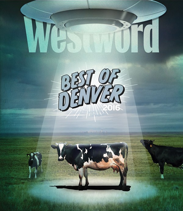
Best Of Denver®
-
Arts & Entertainment
-
Best Free Entertainment
First Friday
-
Best New Festival
Denver Small Press Festival
-
Best Annual Festival
People's Fair
-
Best Zine Festival
Denver Zine Festival
-
Best Free Comedy Show
Too Much Fun!
-
Best Comedy Night
Lucha Libre & Laughs
-
Best Comedy Show in Boulder
The Boulder Comedy Show
-
Best Comedy Club
Comedy Works Downtown
-
Best Comedy Podcast
Empty Girlfriend
-
Best Film Series for Boss Hepcats
In a Lonely Place
-
Best New Super 8MM Film
Tiny Cinema's Moonglow
-
Best Film Series for Theater Lovers
Sie FilmCenter
-
Best Recurring Classic Film Series
Scream Screen
-
Best Mini Film Festival
CineLatino
-
Best Film Festival
Denver Film Festival
-
Best Movie Theater — Programming
Alamo Drafthouse Cinema
-
Best Movie Theater — Food and Drink
Alamo Drafthouse Cinema
-
Best Movie Theater — Comfort
United Artists Denver Pavilions 15
-
Best Web Series
Behind the Smile
-
Best Civic Olympics
Stompin' Ground Games
-
Best Pop-Up Museum
Black Cube
-
Best Incentive to Visit a Museum
Clyfford Still Museum free programs
-
Best Deal for Artists
MCA Denver I'm an Artist program
-
Best Move by the History Colorado Center
New programming
-
Best Museum Redo
Avenir Museum of Design and Merchandising
-
Best New Multi-Purpose Art Space
The Art Gym
-
Best Arts District
River North
-
Best Art Party for Non-Artists
Sculpture Brunch
-
Best Incubator for Visiting Artists and Scholars
Rocky Mountain College of Art + Design
-
Best Window Onto the Creative Process
Denver Art Museum Artists at Work Program
-
Best DIY Space for Academics
Counterpath
-
Best Lowbrow Art Gallery
Sally Centigrade
-
Best Public Art Mural
Project Colfax
-
Best New Public Art
"Shadow Array," by Patrick Marold
-
Best Gallery Show — Solo
John Buck
-
Best Gallery Show — Group
Unexpected Narratives
-
Best Museum Exhibit
Marilyn Minter: Pretty/Dirty
-
Best Juxtaposition of Colorado Artists and International Art Stars
Showing Off
-
Best Showcase for Colorado Artists
Art of the State 2016
-
Best Reunion Show
Vault: MSU Denver Alumni Exhibition
-
Best Salute to a National Park
Trine Bumiller: 100 Paintings for 100 Years
-
Best Memorial Show
The Seen and Unseen: Roland Bernier
-
Best Homage to a Denver Legend
Starring Linda
-
Best Abstract Show — Group
Beyond the Plane
-
Best Abstract Show — Solo
Mark Brasuell: I am not the same person that I was once before
-
Best Contemporary-Realist Show — Solo
Michael J. Dowling: Forgotten Scoundrels
-
Best Contemporary-Realist Show — Group
Roadside Attractions
-
Best Show Done With Erasers
Mind Over Matter: Teresa Booth Brown
-
Best Installation Solo — Soft Materials
Gentle Infestation
-
Best Installation Solo — Hard Materials
a folk tale by Bryan Andrews
-
Best Use of Fruit, Flowers and Nudes
A Tented Sky: New Works by Kristen Hatgi Sink
-
Best Proof That Artists Can Change Course
After the Pale King: Andrew Roberts-Gray
-
Best Painterly Essay on Climate
Stephen Batura: Floodplain
-
Best Ode to Color
Learning to See Color
-
Best Recasting of an Artist's Legacy
Super Indian: Fritz Scholder 1967-1980
-
Best Evidence of Clyfford Still's Eccentricity
Repeat/Recreate: Clyfford Still's "Replicas"
-
Best Celebration of the Absurd
Jokes of Nature
-
Best Celebration of the Rational
Joel Swanson: Polysemic
-
Best Celebration of the Absurd and the Rational
Shawn Huckins: The American __tier
-
Best Aesthetic Response to Football
Critical Focus: Monique Crine
-
Best Aesthetic Response to 4/20
Outpost
-
Best Show About Denver's Hippie Heritage
RetroActive: Founding Spark
-
Best Use of Concrete
The Essence
-
Best Use of Particle Board With Plastic Trim
Derrick Velasquez: New Brutal
-
Best Last-Minute Save for an Art Space
Colorado Photographic Arts Center
-
Best Annual Art Party
Design After Dark
-
Best Theater Trend
Shorter evenings
-
Best Theater Parking
Curious Theatre Company
-
Best Theater Lobby
Edge Theater Company
-
Best Display of Sheer On-Stage Gutsiness
Phamaly Theatre Company, Cabaret
-
Best Revival of a Theatrical Institution
Avenue Theater
-
Best Move by Local Playwrights
Dirtyfish Theater
-
Best Return to the Stage
Heritage Square Music Hall Actors
-
Best Reason to Make the Trek to Lone Tree
Lone Tree Arts Center
-
Best Improvised Theater Space
The Catamounts
-
Best Season for an Actor
Chris Kendall
-
Best Season for an Actress
Emma Messenger
-
Best Performance by an Actor in a Comedy
Paul Borrillo in A Public Reading of an Unproduced Screenplay About the Death of Walt Disney
-
Best Performance by a Supporting Actor in a Comedy
Michael Bouchard in Hysteria
-
Best Performance by an Actor in a Drama
Augustus Truhn in Jerusalem
-
Best Performance by a Supporting Actor in a Drama
Philip Pleasants in All the Way
-
Best Performance by an Actor in a Shakespeare Play
Ben Bonenfant in Henry V
-
Best Performance by a Supporting Actor in a Shakespeare Play
Geoffrey Kent in Othello
-
Best Performance by an Actress in a Shakespeare Play
Carolyn Holding in As You Like It
-
Best Performance by a Supporting Actress in a Shakespeare Play
Emily Kron in As You Like It
-
Best Performance by an Actress in a Drama
Karen Slack in Medea
-
Best Performance by a Supporting Actress in a Drama
Kate Finch in Tribes
-
Best Performance by an Actress in a Comedy
Deborah Persoff in 4000 Miles
-
Best Performance by a Supporting Actress in a Comedy
Jenna Moll Reyes in 4000 Miles
-
Best Performance by an Actress in a Musical
Christina Sajous in The 12
-
Best Performance by a Supporting Actress in a Musical
Cashelle Butler in Young Frankenstein
-
Best Performance by an Actor in a Musical
Scott Beyette in Mary Poppins
-
Best Performance by a Supporting Actor in a Musical
TJ Hogle in Young Frankenstein
-
Best Direction of a Musical
Nick Sugar, Young Frankenstein
-
Best Theater Production
Hysteria
-
Best Theater Season
DCPA Theatre Company
-
Best Gift to Area Theater
Denver Actors Fund
-
Best Feminist Discussion
The Nest
-
Best Training Ground for Future Feminists
Girls Rock Denver
-
Best Kitchen-Sink Performance
Boombaptricks
-
Best Avant-Garde Musical Performance
Nathan Hall's Ghost Light
-
Best Monthly Radical Queer Dance Party
Blow Pony
-
Best Drag Queen
Felony Misdemeanor
-
Best New Queen on the Scene
Jessica L'Whor
-
Best New Drag Show
Kai Lee's Kiki
-
Best Long-Running Drag Show
Drag Nation
-
Best Monthly Dance Party
Circuit Saturday
-
Best Gay Bar
R&R Lounge
-
Best Lesbian Bar
Blush & Blu
-
Best Jukebox
Horseshoe Lounge
-
Best Amateur Drag Competition
Ultimate Queen Challenge
-
Best Tabletop Jukeboxes
Rosie's Diner
-
Best Old-School Venue in New Denver
Mercury Cafe
-
Best Jazz Club
Dazzle Restaurant & Lounge
-
Best Blues Club
Ziggies
-
Best DIY Venue
1010 Workshop
-
Best Sunday-Afternoon Shows
Lola Mexican Fish House
-
Best Club Night
Ominous
-
Best Dance Club
Milk Bar
-
Best Rock Club
Larimer Lounge
-
Best Venue on South Broadway
Mutiny Information Cafe
-
Best New Club
Pearl's
-
Best Indie Booker
Madeline Johnston
-
Best Concert Series
Denver Botanic Gardens Summer Concert Series
-
Best New Music Festival
Bluebird District Music Festival
-
Best Door Person
Yves Rhone
-
Best Karaoke Bar
Armida's Mexican Restaurant and Lounge
-
Best Time Warp
Buffalo Rose
-
Best Hair Band
Grind Cat Grind
-
Best-Dressed Musician
Kalyn Heffernan
-
Best Denver Pride
Bud Bronson & the Good Timers
-
Best Music Video
"Doing It Right," the Yawpers
-
Best Album
Nathaniel Rateliff & the Night Sweats
-
Best Nathaniel Rateliff Song That's Not "S.O.B."
"Howling at Nothing"
-
Best New Band
French Kettle Station
-
Best New Transplant Band
Rootbeer and Mermentau
-
Best New-School/Old-School Collaboration
Sound of Ceres and The Apples in Stereo
-
Best School for Young Musicians
Youth on Record
-
Best Band Fronted by a Television Star
SPELLS
-
Best Subversive Musical Performance
French Kettle Station for Bummeroo 2
-
Best Set at a Hip-Hop Show
A$AP Rocky and Tyler, the Creator at Red Rocks
-
Best Fog at a Red Rocks Concert
Steely Dan and Elvis Costello
-
Best Visuals for Experimental Music
75 Ohms
-
Best Denver Music-History Book
Denvoid and the Cowtown Punks, by Bob Rob Medina
-
Best Concert of the Year
D'Angelo and the Vanguard
-
Best Musician to Leave Denver
Marshall Gallagher
-
Best Resurrection of a Venue
Globe Hall
-
Best Venue to Leave Denver — Permanently
Casselman's
-
-
Shopping & Services
-
Best New Building
The Triangle Building
-
Best New Facebook Group
Denver FUGLY
-
Best Sign of the Times
Save the Signs
-
Best Blog Dedicated to Colfax
ColfaxAvenue.com
-
Best Denver Podcast
The Eddie, Jason and Chris Show
-
Best Denver Instagrammer
Garrett King, @ShortStache
-
Best Hope for Student Journalism
East High Spotlight
-
Best Use of Social Media by a News Anchor
Kyle Clark, 9News
-
Best TV Commercial
"Meet the Dragon," Stevinson Automotive
-
Best Radio Talk-Show Host
Steffan Tubbs, KOA/850-AM
-
Best TV Anchor, 9News
Gary Shapiro
-
Best TV Newscast
7News at 10 p.m.
-
Best TV Morning Show
Daybreak, CW2
-
Best TV Weathercaster
Greg Dutra, Fox31/CW2
-
Best Hair on a TV Personality — Female
Melissa Garcia, CBS4
-
Best Hair on a TV Personality — Male
Chris Parente, Fox31
-
Best Power-Women Meet-Up
Bad News Babes Social Club
-
Best Place to Stalk a Bigfoot
Bigfoot, Yowie & Yeti
-
Best Buffet for Four-Legged Gourmets
Mouthfuls
-
Best Guarantee That Books Go On...and On
Rocky Mountain Land Library
-
Best Place to Check In Before You Check Out
Denver Central Library
-
Best Service for Picky Readers
Denver Public Library
-
Best Cool Magazines
Walled In Magazines
-
Best Bargain Books
Boulder Book Store
-
Best Locals-Only Bookstore
Local Editions Book Store
-
Best Bookstore Shack-Up
BookBar/BookBed
-
Best Boutique Shack-Up
Sewn/Night & Day Vintage
-
Best Gallery Shack-Up
Gallery of Everything/Red Herring Art Supply/Wings Aloft Birdhouse Shop
-
Best Vintage Shack-Up
Curating the Cool/Grooves & Games
-
Best High-End Shack-Up
The Art, a Hotel
-
Best High-End Hostel
Hostel Fish
-
Best Intellectual Exercise
University of Denver Enrichment Program
-
Best Service for Artists
Colorado Attorneys for the Arts
-
Best Craft Classes
The Craftsman and Apprentice
-
Best Block for Shopping and a History Lesson
Larimer Square
-
Best Shooting Lessons
John Fielder's Colorado Photography Workshops
-
Best New Vintage/Antique Store
Lost Love
-
Best Shopping for Antiques and Locally Made Goods
Antique Row
-
Best Coffee Shop for Locally Made Goods
Weathervane Cafe
-
Best Reincarnation of a Store
The Wizard's Chest
-
Best Place for Retro Broncos Gear
Fifty Two 80's
-
Best Store on Broadway
Ironwood
-
Best Store on Colfax Avenue
Spirit Ways
-
Best Store on the 16th Street Mall
I Heart Denver
-
Best Store at DIA
Out West
-
Best Neighborhood Shopping District
Tennyson Street Between 38th and 44th avenues
-
Best Museum Shop
Buffalo Bill Museum & Grave
-
Best Place to Find Rare Local Records
Wax Trax Records
-
Best Blu-ray/DVD Section
Twist & Shout Records
-
Best Record Store in a Bar
Bowman's Vinyl and Lounge
-
Best Place to Buy Used Music Equipment
Lodo Drum Guy
-
Best Thrift Store
Peak Thrift
-
Best Kid-Centric Retail Dynasty
Nest/Hatched/Firebird/Elevated Scraps
-
Best Place to Outfit the Alternative Family
FashioNation
-
Best Gallery in a Streetwear Boutique
Station
-
Best New Womenswear Boutique
Ily and Iley
-
Best Women's Shoe Store Expansion
Two Sole Sisters on Gaylord
-
Best Witchy Goods and Services
Goddess Isis Books & Gifts
-
Best Trip Around the World
Silvana Mondo Gallery — Art Decor & Lifestyle
-
Best Hand-Poke Tattoo Artist
Rachel Paton
-
Best Name for a Tattoo Shop
Kitchen's Ink
-
Best Name for a Hair Salon
Permanent Basis
-
Best Toxin-Free Beauty Store
Aillea
-
Best Soapery
Spinster Sisters Microsoapery
-
Best Salon for Rock-Star Treatment
Seven Sins Salon
-
Best Yoga Studio in a Boutique
Sol Shine
-
Best New Menswear Boutique/Barbershop
Spruce
-
Best Beard Trim
The Usual — A Barber Shop
-
Best Place to Outfit Yourself for Burning Man
Burners Boutique & Costume Consignment
-
Best Vegan Market
Nooch
-
Best New Flea/Farmers' Market
Jefferson Park Farm & Flea
-
Best Flea Market
Horseshoe Market
-
Best Farmers' Market
Boulder Farmers' Market
-
Best Year-Round Farmers' Market
Four Seasons Farmers and Artisans Market
-
Best Flower
Kind Love
-
Best Edibles Line
Incredibles Chocolate and Infused Products
-
Best Head Shop
Illuzion Glass Galleries
-
Best Vape Shop
Mistery Vapor Bar
-
Best Budtender
Courtney Clark
-
Best Dispensary Promotion
Penny Joints for an Empty Can of Oskar Blues Pinner
-
Best Dispensary for a Newb
Good Chemistry
-
Best Dispensary Bang for Your Buck
Lightshade
-
Best Dispensary to Impress Your Pot-Hating Father
The Clinic
-
Best Cannabis Class
Puff, Pass & Paint
-
Best Name for a Dispensary
Pig 'N Whistle
-
-
Food & Drink
-
Best 24/7 Restaurant
Denver Diner
-
Best Breakfast Burrito — Smothered
Phil's Place
-
Best Breakfast Burrito — Handheld
Colorado Taco Co.
-
Best Brunch
The Universal
-
Best Brunch-Time Activity
Sarto's
-
Best Power Breakfast (and Lunch and Dinner)
Racines
-
Best Eggs Benedict
Lou's Food Bar
-
Best Unrecognizable Eggs Benedict
Brazen
-
Best Bottomless-Mimosa Deal
Breakfast on Broadway
-
Best Bottomless-Mimosa Presentation
Curtis Club
-
Best Bloody Mary Bar
Gaetano's
-
Best Fake Bloody Mary
Table 6
-
Best Doughnuts
City Donuts
-
Best Vegan Doughnuts
Beet Box Bakery & Cafe
-
Best Apple Fritters
Brider
-
Best Churros
Dos Santos
-
Best Doughnuts at a Non-Doughnut Shop
My Wife's Donuts
-
Best Ice Cream/Gelato Shop
Amore Gelato
-
Best Brain Freeze
Inventing Room
-
Best Food Cart on the 16th Street Mall
WikiPita
-
Best Food Truck/Cart
Jozi's Kitchen & Shebeen
-
Best Sandwich Shop
Il Porcellino
-
Best Bakery — Sweet
Long I Pie
-
Best Bakery — Savory
Babette's Artisan Bread
-
Best Fast-Casual Concept
Brider
-
Best Children's Menu
The Royal
-
Best Hamburger
Steuben's
-
Best Veggie Burger
Watercourse
-
Best Hot Dog
Biker Jim's Gourmet Dogs
-
Best Vegan Hot Dog
Biker Jim's Gourmet Dogs
-
Best Sausage
Baur's Restaurant and Listening Lounge
-
Best Place for Some Head
Rebel Restaurant
-
Best Place for Some Coq
Cafe Marmotte
-
Best Retro Dish
Rebel Restaurant
-
Best French Fries
The Corner Bar & Cafe
-
Best Mac and Cheese
Rackhouse Pub
-
Best Chicken Wings
Cho77
-
Best Chicken-Liver Mousse
Cart-Driver
-
Best Fried Chicken
CoraFaye's Cafe
-
Best Place to Get Just One Rib
Russell's Smokehouse
-
Best Barbecue Restaurant
Roaming Buffalo Bar-B-Que
-
Best Steakhouse
Blackbelly Market
-
Best Seafood Restaurant
Wild Standard
-
Best Non-Vegetarian Restaurant for Vegetarians
Ophelia's
-
Best Non-Vegan Restaurant for Vegans
Ace
-
Best Vegetarian Restaurant
City, O' City
-
Best Gluten-Free Menu
Revelry Kitchen
-
Best Asian-Italian Fusion
Bones
-
Best Asian-Southern Fusion
Uncle
-
Best Asian-Mexican Fusion
Zengo
-
Best Asian Fusion
Asian Cajun
-
Best Banh Mi
Vinh Xuong Bakery II
-
Best Sushi Bar
Sushi Den
-
Best Octopus
Bar Dough
-
Best Oysters
Stoic & Genuine
-
Best Oyster Treatment
Nocturne
-
Best Japanese Restaurant
Ototo
-
Best Chinese Restaurant
Super Star Asian Cuisine
-
Best Dim Sum
King's Land
-
Best Vietnamese Restaurant
New Saigon
-
Best Noodle Bar
Osaka Ramen
-
Best Pho Restaurant
Pho Duy
-
Best Korean Restaurant
Tofu House
-
Best Thai Restaurant
Taste of Thailand
-
Best Indian Restaurant
Masalaa
-
Best Ethiopian Restaurant
Megenagna
-
Best Middle Eastern Restaurant
Sahara Restaurant
-
Best French Restaurant
Mizuna
-
Best German/Eastern European Restaurant
Golden Europe
-
Best Italian Restaurant
Spuntino
-
Best Pizza
Racca's Pizzeria Napoletana
-
Best New York-Style Pizza
SliceWorks
-
Best Detroit-Style Pizza
Blue Pan Pizza
-
Best Chicago-Style Pizza
Denver Deep Dish
-
Best Vegan Pizza
Pie Hole
-
Best Wacky Slice
Hops & Pie
-
Best Central/South American Restaurant
Maria Empanada
-
Best Nachos
North County
-
Best Green Chile
El Tejado
-
Best Vegetarian Green Chile
Blackbelly Market
-
Best Tacos
Taqueria El Trompito
-
Best Tamales
La Popular
-
Best House Margaritas
Adelitas Cocina y Cantina
-
Best All-Day Happy Hour
Historians Ale House
-
Best All-Day Drink Deal
Bannock Street Garage
-
Best Late-Night Happy Hour
LoHi SteakBar
-
Best Late-Afternoon Happy Hour
Squeaky Bean
-
Best Japanese Happy Hour
Ototo
-
Best Wine Bar
Brik on York
-
Best Restaurant Wine List
Black Cat
-
Best Restaurant By-the-Glass Wine List
Neighbors
-
Best Single Malt
Wood's High Mountain Distillery
-
Best Colorado Distillery
Golden Moon Distillery
-
Best New Brewery Tap Room
Ratio Beerworks
-
Best Brewery Tap Room — Beer
Station 26 Brewing
-
Best Brewery Tap Room — Ambience
Spangalang Brewery
-
Best Suburban Brewery Tap Room — Ambience
Grist Brewing
-
Best Brewery Tap Room — Patio
Black Shirt Brewing
-
Best Brewery Rebirth
Tivoli Brewing
-
Best Brewery Snack Wall
Finkel & Garf Brewing
-
Best Brewery Innovation
The Crowler
-
Best Place to Sample Expensive Beer
First Draft Taproom & Kitchen
-
Best Speakeasy
Arvada Tavern
-
Best Dive Bar
Sam's Bar & Lounge
-
Best Cocktails in a Dive Bar
Star Bar
-
Best Classic Cocktail Bar
The Cooper Lounge
-
Best New Cocktail Bar
Bar Fausto
-
Best Mocktail Program
Syntax Physic Opera
-
Best Cocktail Program
Squeaky Bean
-
Best New Bar
Union Lodge No.1
-
Best Bartender
Chris Clewell
-
Best Bar Neighborhood
Upper Larimer Street
-
Best New Cocktail
Linger
-
Best New Spirit
Leopold Bros.
-
Best New Cocktail Trend
Tea and Coffee
-
Best Coffee Cocktail
Corvus
-
Best New Tea Spot
Platform T
-
Best New Coffeehouse
Black Eye Cap Hill
-
Best Neighborhood Coffee Shop
Whittier Cafe
-
Best Coffeehouse for Getting Work Done
Rooster & Moon
-
Best Coffee Program at a Restaurant
Mercantile Dining and Provisions
-
Best Cold Brew
Corvus Coffee
-
Best Cortado
Aviano Coffee
-
Best Barista Mustache
Andrew Norman
-
Best Underground Coffee Event
Latte-art throwdowns
-
Best Restaurant Bathroom
Black Eye Cap Hill
-
Best Coffee-Shop Patio
Aviano Coffee
-
Best Restaurant Patio
Bistro Vendôme
-
Best Neighborhood Restaurant Patio
Kaos Pizzeria
-
Best Rooftop Patio
Avanti Food & Beverage
-
Best Patio for Pets
Subculture
-
Best Restaurant on Colfax Avenue
To the Wind Bistro
-
Best Restaurant on Broadway
Cho77
-
Best Restaurant on West 32nd Avenue
Solitaire
-
Best Restaurant on Federal Boulevard
Columbine Steak House & Lounge
-
Best Restaurant on Havana Street
Seoul BBQ & Sushi
-
Best Restaurant on the Pearl Street Mall
Japango
-
Best Service
Nocturne
-
Best New Restaurant Neighborhood
Berkeley
-
Best New Neighborhood Restaurant
Desmond Bar and Grill
-
Best Chef
Mark Ferguson
-
Best New Restaurant
Hop Alley
-
-
Sports & Recreation
-
Best Guess for When Denver Will Go Back to the Super Bowl
2018
-
Best Bronco
Von Miller
-
Best Rockie
Nolan Arenado
-
Best Nugget
Will Barton
-
Best Av
Matt Duchene
-
Best Sports Team — Professional
Denver Broncos
-
Best Sports Team — College
University of Colorado Boulder men's basketball team
-
Best Coach — Professional
Wade Phillips
-
Best Coach — College
Tad Boyle, University of Colorado Boulder men's basketball team
-
Best Sports Announcer
Alan Roach
-
Best TV Sportscaster
Vic Lombardi
-
Best Sports Mascot
Thunder
-
Best Talk-Radio Sports Show
The Drive
-
Best Youth Program to Flip For
Mile High Tumblers
-
Best Cheap Summer Fun
Lakeside Amusement Park
-
Best Arcade
Hyperspace
-
Best Historic Gym
20th Street Gym
-
Best Gym Membership on a Budget
Denver Parks and Recreation
-
Best Place to Work on Your Jump Shot
1125 17th St.
-
Best Free View of the Denver Skyline
Barnum Park
-
Best Playground Makeover
Dinosaur Gulch
-
Best People-Watching Park
Cheesman Park
-
Best Timely Reminder
Cranmer Park
-
Best Pocket Park
Lowry Reading Garden
-
Best Dog Park
Cherry Creek State Park
-
Best Dog Park for Small Dogs
Berkeley Lake Dog Park
-
Best First Friday Activity for Dogs
Paw Prints & Cocktails
-
Best Annual Dog Days
Pawpalooza
-
Best Sports Bar for Dogs
Ugly Dog Sports Cafe
-
Best Place to Catch Aspiring Daredevils in Action
Trestle Bike Skills Course
-
Best Bike Path in Metro Denver
Clear Creek Trail
-
Best Mountain-Bike Trail
Buffalo Creek Recreation Area, Conifer
-
Best Mountain-Bike Park
Keystone Bike Park
-
Best Reinvention of a Beloved Bike Shop
Two-Wheel Feel
-
Best Bike Shop for Your Beloved Bike
Adventure Cycling
-
Best Quickie Hike
Beaver Brook Trail
-
Best Hike for a Quickie
Forsythe Canyon, Boulder
-
Best Disc Golf With Beverage
Loomiller
-
Best Small-Town Rodeo
The Rooftop Rodeo
-
Best New Hot Springs
Iron Mountain Hot Springs
-
Best Skate Park
Mehaffey Park
-
Best Terrain Park
A51
-
Best Double-Diamond Run
No Names Steamboat
-
Best Halfpipe
Vail
-
Best Ski Deal for Kids
Vail Resorts
-
Best Season-Pass Deal
Rocky Mountain SuperPass Plus
-
Best Cat Skiing
Keystone Adventure Tours
-
Best Ski Porn
Small World, Level 1 Productions
-
Best Boards for Locavores —Ski
Icelantic
-
Best Boards for Locavores — Snowboard
High Society Freeride
-
Best Boards for Locavores — SUP
Hala Gear
-
Best Sports Bar for Food and Drink
Whiskey Tango Foxtrot
-
Best Sports Bar for Watching Games
The Three Lions
-
Best Sports Bar for Playing Games
Blake Street Tavern
-
-
Readers' Choice
-
Readers’ Choice: Best new restaurant
Avanti Food & Beverage
-
Reader's Choice: Best new restaurant neighborhood
RiNo
-
Readers' Choice: Best new neighborhood restaurant
Bar Dough
-
Readers' Choice: Best restaurant on Colfax Avenue
Sassafras American Eatery
-
Readers' Choice: Best restaurant on Federal Boulevard
New Saigon
-
Readers' Choice: Best restaurant on Broadway
Beatrice & Woodsley
-
Readers' Choice: Best restaurant on West 32nd Avenue
Highland Tap and Burger
-
Readers' Choice: Best restaurant on Havana Street
Sam's No. 3
-
Readers' Choice: Best restaurant on the Pearl Street Mall
OAK at fourteenth
-
Readers' Choice: Best chef
Troy Guard
-
Readers' Choice: Best bartender
Brittany Wangsness
-
Readers' Choice: Best new bar
Bar Fausto
-
Readers' Choice: Best dive bar
Hi-Dive
-
Readers' Choice: Best classic cocktail bar
Williams & Graham
-
Readers' Choice: Best wine bar
Lala's Wine Bar + Pizzeria
-
Readers' Choice: Best Colorado distillery
Leopold Bros.
-
Readers' Choice: Best new brewery tap room
Fiction Beer Company
-
Readers' Choice: Best brewery tap room – beer
Ratio Beerworks
-
Readers' Choice: Best new brewery tap room – ambience
Ratio Beerworks
-
Readers' Choice: Best restaurant wine list
Mizuna
-
Readers' Choice: Best restaurant by-the glass wine list
Lala's Wine Bar + Pizzeria
-
Readers' Choice: Best Bloody Mary bar
Lou's Food Bar
-
Readers' Choice: Best new coffeehouse
Black Eye Coffee CapHill
-
Readers' Choice: Best ice cream/gelato shop
Sweet Action Ice Cream
-
Readers' Choice: Best doughnuts
Voodoo Doughnut
-
Readers' Choice: Best bakery – savory
Grateful Bread Company
-
Readers' Choice: Best bakery – sweet
Wooden Spoon Cafe & Bakery
-
Readers' Choice: Best vegetarian restaurant
City, O' City
-
Readers' Choice: Best non-vegetarian restaurant for vegetarians
Root Down
-
Readers' Choice: Best non-vegan restaurant for vegans
Root Down
-
Readers' Choice: Best gluten-free menu
Vesta Dipping Grill
-
Readers' Choice: Best veggie burger
Park Burger
-
Readers' Choice: Best hamburger
Cherry Cricket
-
Readers' Choice: Best hot dog
Biker Jim's Gourmet Dogs
-
Readers' Choice: Best sausage
Biker Jim's Gourmet Dogs
-
Readers' Choice: best french fries
Park Burger
-
Readers' Choice: best mac and cheese
Steuben's Food Service
-
Readers' Choice: Best fried chicken
White Fence Farm
-
Readers' Choice: Best chicken wings
Fire on the Mountain
-
Readers' Choice: Best sandwich shop
Snarf's
-
Readers' Choice: Best local fast-casual concept
-
Readers' Choice: Best local fast-casual concept
-
Readers's Choice: Best barbecue restaurant
-
Readers's Choice: Best barbecue restaurant
-
Readers' Choice: Best steakhouse
Guard and Grace
-
Readers' Choice: Best seafood restaurant
Jax Fish House
-
Readers' Choice: best sushi bar
Sushi Den
-
Readers' Choice: Best oysters
Jax Fish House
-
Readers' Choice: Best Japanese restaurant
Domo
-
Readers' Choice: Chinese restaurant
Star Kitchen
-
Reader' Choice: Best dim sum
Star Kitchen
-
Readers' Choice: Best Vietnamese restaurant
New Saigon
-
Readers' Choice: Best pho restaurant
Pho 95
-
Readers' Choice: Best noodle bar
Uncle
-
Readers' Choice: Best Thai restaurant
Thai Monkey Club
-
Readers' Choice: Best Korean restaurant
Dae Gee
-
Readers' Choice: Best Indian Restaurant
Little India
-
Readers' Choice: Best Ethiopian restaurant
Queen of Sheba
-
Readers' Choice: Best Middle Eastern restaurant
Jerusalem Restaurant
-
Readers' Choice: Best Italian restaurant
Osteria Marco
-
Readers' Choice: Best pizza
Hops & Pie
-
Readers' Choice: Best New York-style pizza
Fat Sully's
-
Readers' Choice: Best Chicago-style pizza
Patxi's Pizza
-
Readers' Choice: Best French Restaurant
Bistro Vendome
-
Readers' Choice: Best German/Eastern European restaurant
Euclid Hall
-
Readers' Choice: Best Central/South American restaurant (not Mexican)
Cuba Cuba Cafe & Bar
-
Readers' Choice: Best house margarita
Rio Grande Mexican Restaurant
-
Readers' Choice: Best green chile
Santiago's
-
Readers' Choice: Best vegetarian green chile
Illegal Pete's
-
Readers' Choice: Best tacos
Pinche tacos
-
Readers' Choice: Best Tamales
Tamale Kitchen
-
Readers' Choice: Best food truck/cart
Steuben's Food Truck
-
Best breakfast burrito – smothered
Santiago's
-
Best breakfast burrito – handheld
Santiago's
-
Readers' Choice: Best brunch
Lucile's Creole Cafe
-
Readers' Choice: Best bottomless-mimosa deal
Root Down
-
Readers' Choice: Best late-afternoon happy hour
Highland Tap and Burger
-
Readers' Choice: Best late-night happy hour
Highland Tap and Burger
-
Readers' Choice: Best 24/7 restaurant
Pete's Kitchen
-
Readers' Choice: Best restaurant patio
Avanti Food & Beverage
-
Readers' Choice: Best rooftop patio
Linger
-
Readers' Choice: Best patio for pets
Denver Beer Co.
-
Readers' Choice: Best Denver podcast
Whiskey and Cigarettes
-
Readers' Choice: Best Denver Instagrammer
@milehighandhungry
-
Readers' Choice: Best radio talk-show host
Slacker
-
Readers' Choice: Best local TV anchor
Kyle Clark
-
Readers' Choice: Best local TV newscast
9News
-
Readers' Choice: Best local TV weathercaster
Kathy Sabine
-
Readers' Choice: Best hair on a TV personality – female
Kathy Sabine
-
Readers' Choice: Best hair on a TV personality – male
Kyle Clark
-
Readers' Choice: Best name for a hair salon
Big Hairy Monster
-
Readers' Choice: Best name for a tattoo shop
Think Tank Tattoo
-
Readers' Choice: Best name for a marijuana dispensary
The Giving Tree of Denver
-
Readers' Choice: Best head shop
Purple Haze
-
Readers' Choice: Best vape shop
RiNo Vapes
-
Readers' Choice: Best farmers' market
South Pearl Street Farmers Market
-
Readers' Choice: Best museum shop
Denver Museum of Nature and Science
-
Readers' Choice: Best store at DIA
Tattered Cover
-
Readers' Choice: Best store at DIA
Tattered Cover
-
Readers' Choice: Best store on Broadway
Buffalo Exchange
-
Readers' Choice: Best store on Colfax
Twist & Shout
-
Readers' Choice: Best store on 16th Street Mall
Tattered Cover
-
Readers' Choice: Best neighborhood shopping district
South Broadway
-
Readers' Choice: Best flea market
Denver Flea
-
Readers' Choice: Best thrift store
Buffalo Exchange
-
Readers' Choice: Best Bronco
Von Miller
-
Readers' Choice: Best Rockie
Nolan Arenado
-
Readers' Choice: Best Nugget
Kenneth Faried
-
Readers' Choice: Best Av
Matt Duchene
-
Readers' Choice: Best sports team – professional
Denver Broncos
-
Readers' Choice: Best sports team – college
DU Hockey
-
Readers' Choice: Best coach – professional
Gary Kubiak
-
Readers' Choice: Best coach – college
Tad Boyle
-
Readers' Choice: Best sports announcer
Dave Logan
-
Readers' Choice: Best TV sportscaster
Drew Soicher
-
Readers' Choice: Best local talk-radio sports show
The Drive With Big Al and D-Mac
-
Readers' Choice: Best sports mascot
Rocky
-
Readers' Choice: Best dog park
Chatfield State Park
-
Readers' Choice: Best skate park
Denver Skatepark
-
Readers' Choice: Best terrain park
Copper Mountain
-
Readers' Choice: Best double-diamond run
Drunken Frenchman
-
Readers' Choice: Best bike path in metro Denver
Cherry Creek Trail
-
Readers' Choice: Best mountain-bike trail
Bear Creek Trail
-
Readers' Choice: Best sports bar for watching games
Stoney's Bar and Grill
-
Readers' Choice: Best sports bar for playing games
The 1up
-
Readers' Choice: Best sports bar for food and drink
Highland Tap and Burger
-
Readers' Choice: Best free entertainment
City Park Jazz
-
Readers' Choice: Best new festival
Larimer Block Party
-
Readers' Choice: Best annual festival
Great American Beer Festival
-
Readers' Choice: Best Denver arts district
Art District on Santa Fe
-
Readers' Choice: Best museum exhibit
Mythic Creatures: Dragons, Unicorns, and Mermaids
-
Readers' Choice: Best gallery show – solo
Room With a View by Molly Bounds
-
Readers' Choice: Best gallery show – group
Monkey Business
-
Readers' Choice: Best film festival
Denver Film Festival
-
Readers' Choice: Best movie theater – food/drink
Alamo Drafthouse
-
Readers' Choice: Best movie theater – programming
Alamo Drafthouse
-
Readers' Choice: Best movie theater – comfot
Alamo Drafthouse
-
Readers' Choice: Best theater production
The Book of Mormon
-
Readers' Choice: Best theater season
The Buell Theatre
-
Readers' Choice: Best comedy night
Comedy Works
-
Readers' Choice: Best karaoke bar
Armida's Restaurant
-
Readers' Choice: Best gay bar
Tracks
-
Readers' Choice: Best lesbian bar
Blush & Blu
-
Readers' Choice: Best DIY venue
Upstairs Circus
-
Readers' Choice: Best jukebox
Sancho's Broken Arrow
-
Readers' Choice: Best club night
Mile High Soul Club at Syntax: Physic Opera
-
Readers' Choice: Best new club
Ophelia’s Electric Soapbox
-
Readers' Choice: Best blues club
El Chapultepec
-
Readers' Choice: Best jazz club
El Chapultepec
-
Readers' Choice: Best dance club
Tracks
-
Readers' Choice: Best rock club
Hi-Dive
-
Readers' Choice: Best local music video
"S.O.B." by Nathaniel Rateliff & The Night Sweats
-
Readers' Choice: Best local album
Nathaniel Rateliff & The Night Sweats
-
Readers' Choice: Best concert of the year
Nathaniel Rateliff & The Night Sweats
-
Readers' Choice: Best New Public Art
Project Colfax
-
Readers' Choice: Best Guess for When Denver Will Go Back to the Super Bowl
2020
-
Best Of
-
Arts & Entertainment
-
Best Free Entertainment
First Friday
-
Best New Festival
Denver Small Press Festival
-
Best Annual Festival
People's Fair
-
Best Zine Festival
Denver Zine Festival
-
Best Free Comedy Show
Too Much Fun!
-
Best Comedy Night
Lucha Libre & Laughs
-
Best Comedy Show in Boulder
The Boulder Comedy Show
-
Best Comedy Club
Comedy Works Downtown
-
Best Comedy Podcast
Empty Girlfriend
-
Best Film Series for Boss Hepcats
In a Lonely Place
-
Best New Super 8MM Film
Tiny Cinema's Moonglow
-
Best Film Series for Theater Lovers
Sie FilmCenter
-
Best Recurring Classic Film Series
Scream Screen
-
Best Mini Film Festival
CineLatino
-
Best Film Festival
Denver Film Festival
-
Best Movie Theater — Programming
Alamo Drafthouse Cinema
-
Best Movie Theater — Food and Drink
Alamo Drafthouse Cinema
-
Best Movie Theater — Comfort
United Artists Denver Pavilions 15
-
Best Web Series
Behind the Smile
-
Best Civic Olympics
Stompin' Ground Games
-
Best Pop-Up Museum
Black Cube
-
Best Incentive to Visit a Museum
Clyfford Still Museum free programs
-
Best Deal for Artists
MCA Denver I'm an Artist program
-
Best Move by the History Colorado Center
New programming
-
Best Museum Redo
Avenir Museum of Design and Merchandising
-
Best New Multi-Purpose Art Space
The Art Gym
-
Best Arts District
River North
-
Best Art Party for Non-Artists
Sculpture Brunch
-
Best Incubator for Visiting Artists and Scholars
Rocky Mountain College of Art + Design
-
Best Window Onto the Creative Process
Denver Art Museum Artists at Work Program
-
Best DIY Space for Academics
Counterpath
-
Best Lowbrow Art Gallery
Sally Centigrade
-
Best Public Art Mural
Project Colfax
-
Best New Public Art
"Shadow Array," by Patrick Marold
-
Best Gallery Show — Solo
John Buck
-
Best Gallery Show — Group
Unexpected Narratives
-
Best Museum Exhibit
Marilyn Minter: Pretty/Dirty
-
Best Juxtaposition of Colorado Artists and International Art Stars
Showing Off
-
Best Showcase for Colorado Artists
Art of the State 2016
-
Best Reunion Show
Vault: MSU Denver Alumni Exhibition
-
Best Salute to a National Park
Trine Bumiller: 100 Paintings for 100 Years
-
Best Memorial Show
The Seen and Unseen: Roland Bernier
-
Best Homage to a Denver Legend
Starring Linda
-
Best Abstract Show — Group
Beyond the Plane
-
Best Abstract Show — Solo
Mark Brasuell: I am not the same person that I was once before
-
Best Contemporary-Realist Show — Solo
Michael J. Dowling: Forgotten Scoundrels
-
Best Contemporary-Realist Show — Group
Roadside Attractions
-
Best Show Done With Erasers
Mind Over Matter: Teresa Booth Brown
-
Best Installation Solo — Soft Materials
Gentle Infestation
-
Best Installation Solo — Hard Materials
a folk tale by Bryan Andrews
-
Best Use of Fruit, Flowers and Nudes
A Tented Sky: New Works by Kristen Hatgi Sink
-
Best Proof That Artists Can Change Course
After the Pale King: Andrew Roberts-Gray
-
Best Painterly Essay on Climate
Stephen Batura: Floodplain
-
Best Ode to Color
Learning to See Color
-
Best Recasting of an Artist's Legacy
Super Indian: Fritz Scholder 1967-1980
-
Best Evidence of Clyfford Still's Eccentricity
Repeat/Recreate: Clyfford Still's "Replicas"
-
Best Celebration of the Absurd
Jokes of Nature
-
Best Celebration of the Rational
Joel Swanson: Polysemic
-
Best Celebration of the Absurd and the Rational
Shawn Huckins: The American __tier
-
Best Aesthetic Response to Football
Critical Focus: Monique Crine
-
Best Aesthetic Response to 4/20
Outpost
-
Best Show About Denver's Hippie Heritage
RetroActive: Founding Spark
-
Best Use of Concrete
The Essence
-
Best Use of Particle Board With Plastic Trim
Derrick Velasquez: New Brutal
-
Best Last-Minute Save for an Art Space
Colorado Photographic Arts Center
-
Best Annual Art Party
Design After Dark
-
Best Theater Trend
Shorter evenings
-
Best Theater Parking
Curious Theatre Company
-
Best Theater Lobby
Edge Theater Company
-
Best Display of Sheer On-Stage Gutsiness
Phamaly Theatre Company, Cabaret
-
Best Revival of a Theatrical Institution
Avenue Theater
-
Best Move by Local Playwrights
Dirtyfish Theater
-
Best Return to the Stage
Heritage Square Music Hall Actors
-
Best Reason to Make the Trek to Lone Tree
Lone Tree Arts Center
-
Best Improvised Theater Space
The Catamounts
-
Best Season for an Actor
Chris Kendall
-
Best Season for an Actress
Emma Messenger
-
Best Performance by an Actor in a Comedy
Paul Borrillo in A Public Reading of an Unproduced Screenplay About the Death of Walt Disney
-
Best Performance by a Supporting Actor in a Comedy
Michael Bouchard in Hysteria
-
Best Performance by an Actor in a Drama
Augustus Truhn in Jerusalem
-
Best Performance by a Supporting Actor in a Drama
Philip Pleasants in All the Way
-
Best Performance by an Actor in a Shakespeare Play
Ben Bonenfant in Henry V
-
Best Performance by a Supporting Actor in a Shakespeare Play
Geoffrey Kent in Othello
-
Best Performance by an Actress in a Shakespeare Play
Carolyn Holding in As You Like It
-
Best Performance by a Supporting Actress in a Shakespeare Play
Emily Kron in As You Like It
-
Best Performance by an Actress in a Drama
Karen Slack in Medea
-
Best Performance by a Supporting Actress in a Drama
Kate Finch in Tribes
-
Best Performance by an Actress in a Comedy
Deborah Persoff in 4000 Miles
-
Best Performance by a Supporting Actress in a Comedy
Jenna Moll Reyes in 4000 Miles
-
Best Performance by an Actress in a Musical
Christina Sajous in The 12
-
Best Performance by a Supporting Actress in a Musical
Cashelle Butler in Young Frankenstein
-
Best Performance by an Actor in a Musical
Scott Beyette in Mary Poppins
-
Best Performance by a Supporting Actor in a Musical
TJ Hogle in Young Frankenstein
-
Best Direction of a Musical
Nick Sugar, Young Frankenstein
-
Best Theater Production
Hysteria
-
Best Theater Season
DCPA Theatre Company
-
Best Gift to Area Theater
Denver Actors Fund
-
Best Feminist Discussion
The Nest
-
Best Training Ground for Future Feminists
Girls Rock Denver
-
Best Kitchen-Sink Performance
Boombaptricks
-
Best Avant-Garde Musical Performance
Nathan Hall's Ghost Light
-
Best Monthly Radical Queer Dance Party
Blow Pony
-
Best Drag Queen
Felony Misdemeanor
-
Best New Queen on the Scene
Jessica L'Whor
-
Best New Drag Show
Kai Lee's Kiki
-
Best Long-Running Drag Show
Drag Nation
-
Best Monthly Dance Party
Circuit Saturday
-
Best Gay Bar
R&R Lounge
-
Best Lesbian Bar
Blush & Blu
-
Best Jukebox
Horseshoe Lounge
-
Best Amateur Drag Competition
Ultimate Queen Challenge
-
Best Tabletop Jukeboxes
Rosie's Diner
-
Best Old-School Venue in New Denver
Mercury Cafe
-
Best Jazz Club
Dazzle Restaurant & Lounge
-
Best Blues Club
Ziggies
-
Best DIY Venue
1010 Workshop
-
Best Sunday-Afternoon Shows
Lola Mexican Fish House
-
Best Club Night
Ominous
-
Best Dance Club
Milk Bar
-
Best Rock Club
Larimer Lounge
-
Best Venue on South Broadway
Mutiny Information Cafe
-
Best New Club
Pearl's
-
Best Indie Booker
Madeline Johnston
-
Best Concert Series
Denver Botanic Gardens Summer Concert Series
-
Best New Music Festival
Bluebird District Music Festival
-
Best Door Person
Yves Rhone
-
Best Karaoke Bar
Armida's Mexican Restaurant and Lounge
-
Best Time Warp
Buffalo Rose
-
Best Hair Band
Grind Cat Grind
-
Best-Dressed Musician
Kalyn Heffernan
-
Best Denver Pride
Bud Bronson & the Good Timers
-
Best Music Video
"Doing It Right," the Yawpers
-
Best Album
Nathaniel Rateliff & the Night Sweats
-
Best Nathaniel Rateliff Song That's Not "S.O.B."
"Howling at Nothing"
-
Best New Band
French Kettle Station
-
Best New Transplant Band
Rootbeer and Mermentau
-
Best New-School/Old-School Collaboration
Sound of Ceres and The Apples in Stereo
-
Best School for Young Musicians
Youth on Record
-
Best Band Fronted by a Television Star
SPELLS
-
Best Subversive Musical Performance
French Kettle Station for Bummeroo 2
-
Best Set at a Hip-Hop Show
A$AP Rocky and Tyler, the Creator at Red Rocks
-
Best Fog at a Red Rocks Concert
Steely Dan and Elvis Costello
-
Best Visuals for Experimental Music
75 Ohms
-
Best Denver Music-History Book
Denvoid and the Cowtown Punks, by Bob Rob Medina
-
Best Concert of the Year
D'Angelo and the Vanguard
-
Best Musician to Leave Denver
Marshall Gallagher
-
Best Resurrection of a Venue
Globe Hall
-
Best Venue to Leave Denver — Permanently
Casselman's
-
-
Shopping & Services
-
Best New Building
The Triangle Building
-
Best New Facebook Group
Denver FUGLY
-
Best Sign of the Times
Save the Signs
-
Best Blog Dedicated to Colfax
ColfaxAvenue.com
-
Best Denver Podcast
The Eddie, Jason and Chris Show
-
Best Denver Instagrammer
Garrett King, @ShortStache
-
Best Hope for Student Journalism
East High Spotlight
-
Best Use of Social Media by a News Anchor
Kyle Clark, 9News
-
Best TV Commercial
"Meet the Dragon," Stevinson Automotive
-
Best Radio Talk-Show Host
Steffan Tubbs, KOA/850-AM
-
Best TV Anchor, 9News
Gary Shapiro
-
Best TV Newscast
7News at 10 p.m.
-
Best TV Morning Show
Daybreak, CW2
-
Best TV Weathercaster
Greg Dutra, Fox31/CW2
-
Best Hair on a TV Personality — Female
Melissa Garcia, CBS4
-
Best Hair on a TV Personality — Male
Chris Parente, Fox31
-
Best Power-Women Meet-Up
Bad News Babes Social Club
-
Best Place to Stalk a Bigfoot
Bigfoot, Yowie & Yeti
-
Best Buffet for Four-Legged Gourmets
Mouthfuls
-
Best Guarantee That Books Go On...and On
Rocky Mountain Land Library
-
Best Place to Check In Before You Check Out
Denver Central Library
-
Best Service for Picky Readers
Denver Public Library
-
Best Cool Magazines
Walled In Magazines
-
Best Bargain Books
Boulder Book Store
-
Best Locals-Only Bookstore
Local Editions Book Store
-
Best Bookstore Shack-Up
BookBar/BookBed
-
Best Boutique Shack-Up
Sewn/Night & Day Vintage
-
Best Gallery Shack-Up
Gallery of Everything/Red Herring Art Supply/Wings Aloft Birdhouse Shop
-
Best Vintage Shack-Up
Curating the Cool/Grooves & Games
-
Best High-End Shack-Up
The Art, a Hotel
-
Best High-End Hostel
Hostel Fish
-
Best Intellectual Exercise
University of Denver Enrichment Program
-
Best Service for Artists
Colorado Attorneys for the Arts
-
Best Craft Classes
The Craftsman and Apprentice
-
Best Block for Shopping and a History Lesson
Larimer Square
-
Best Shooting Lessons
John Fielder's Colorado Photography Workshops
-
Best New Vintage/Antique Store
Lost Love
-
Best Shopping for Antiques and Locally Made Goods
Antique Row
-
Best Coffee Shop for Locally Made Goods
Weathervane Cafe
-
Best Reincarnation of a Store
The Wizard's Chest
-
Best Place for Retro Broncos Gear
Fifty Two 80's
-
Best Store on Broadway
Ironwood
-
Best Store on Colfax Avenue
Spirit Ways
-
Best Store on the 16th Street Mall
I Heart Denver
-
Best Store at DIA
Out West
-
Best Neighborhood Shopping District
Tennyson Street Between 38th and 44th avenues
-
Best Museum Shop
Buffalo Bill Museum & Grave
-
Best Place to Find Rare Local Records
Wax Trax Records
-
Best Blu-ray/DVD Section
Twist & Shout Records
-
Best Record Store in a Bar
Bowman's Vinyl and Lounge
-
Best Place to Buy Used Music Equipment
Lodo Drum Guy
-
Best Thrift Store
Peak Thrift
-
Best Kid-Centric Retail Dynasty
Nest/Hatched/Firebird/Elevated Scraps
-
Best Place to Outfit the Alternative Family
FashioNation
-
Best Gallery in a Streetwear Boutique
Station
-
Best New Womenswear Boutique
Ily and Iley
-
Best Women's Shoe Store Expansion
Two Sole Sisters on Gaylord
-
Best Witchy Goods and Services
Goddess Isis Books & Gifts
-
Best Trip Around the World
Silvana Mondo Gallery — Art Decor & Lifestyle
-
Best Hand-Poke Tattoo Artist
Rachel Paton
-
Best Name for a Tattoo Shop
Kitchen's Ink
-
Best Name for a Hair Salon
Permanent Basis
-
Best Toxin-Free Beauty Store
Aillea
-
Best Soapery
Spinster Sisters Microsoapery
-
Best Salon for Rock-Star Treatment
Seven Sins Salon
-
Best Yoga Studio in a Boutique
Sol Shine
-
Best New Menswear Boutique/Barbershop
Spruce
-
Best Beard Trim
The Usual — A Barber Shop
-
Best Place to Outfit Yourself for Burning Man
Burners Boutique & Costume Consignment
-
Best Vegan Market
Nooch
-
Best New Flea/Farmers' Market
Jefferson Park Farm & Flea
-
Best Flea Market
Horseshoe Market
-
Best Farmers' Market
Boulder Farmers' Market
-
Best Year-Round Farmers' Market
Four Seasons Farmers and Artisans Market
-
Best Flower
Kind Love
-
Best Edibles Line
Incredibles Chocolate and Infused Products
-
Best Head Shop
Illuzion Glass Galleries
-
Best Vape Shop
Mistery Vapor Bar
-
Best Budtender
Courtney Clark
-
Best Dispensary Promotion
Penny Joints for an Empty Can of Oskar Blues Pinner
-
Best Dispensary for a Newb
Good Chemistry
-
Best Dispensary Bang for Your Buck
Lightshade
-
Best Dispensary to Impress Your Pot-Hating Father
The Clinic
-
Best Cannabis Class
Puff, Pass & Paint
-
Best Name for a Dispensary
Pig 'N Whistle
-
-
Food & Drink
-
Best 24/7 Restaurant
Denver Diner
-
Best Breakfast Burrito — Smothered
Phil's Place
-
Best Breakfast Burrito — Handheld
Colorado Taco Co.
-
Best Brunch
The Universal
-
Best Brunch-Time Activity
Sarto's
-
Best Power Breakfast (and Lunch and Dinner)
Racines
-
Best Eggs Benedict
Lou's Food Bar
-
Best Unrecognizable Eggs Benedict
Brazen
-
Best Bottomless-Mimosa Deal
Breakfast on Broadway
-
Best Bottomless-Mimosa Presentation
Curtis Club
-
Best Bloody Mary Bar
Gaetano's
-
Best Fake Bloody Mary
Table 6
-
Best Doughnuts
City Donuts
-
Best Vegan Doughnuts
Beet Box Bakery & Cafe
-
Best Apple Fritters
Brider
-
Best Churros
Dos Santos
-
Best Doughnuts at a Non-Doughnut Shop
My Wife's Donuts
-
Best Ice Cream/Gelato Shop
Amore Gelato
-
Best Brain Freeze
Inventing Room
-
Best Food Cart on the 16th Street Mall
WikiPita
-
Best Food Truck/Cart
Jozi's Kitchen & Shebeen
-
Best Sandwich Shop
Il Porcellino
-
Best Bakery — Sweet
Long I Pie
-
Best Bakery — Savory
Babette's Artisan Bread
-
Best Fast-Casual Concept
Brider
-
Best Children's Menu
The Royal
-
Best Hamburger
Steuben's
-
Best Veggie Burger
Watercourse
-
Best Hot Dog
Biker Jim's Gourmet Dogs
-
Best Vegan Hot Dog
Biker Jim's Gourmet Dogs
-
Best Sausage
Baur's Restaurant and Listening Lounge
-
Best Place for Some Head
Rebel Restaurant
-
Best Place for Some Coq
Cafe Marmotte
-
Best Retro Dish
Rebel Restaurant
-
Best French Fries
The Corner Bar & Cafe
-
Best Mac and Cheese
Rackhouse Pub
-
Best Chicken Wings
Cho77
-
Best Chicken-Liver Mousse
Cart-Driver
-
Best Fried Chicken
CoraFaye's Cafe
-
Best Place to Get Just One Rib
Russell's Smokehouse
-
Best Barbecue Restaurant
Roaming Buffalo Bar-B-Que
-
Best Steakhouse
Blackbelly Market
-
Best Seafood Restaurant
Wild Standard
-
Best Non-Vegetarian Restaurant for Vegetarians
Ophelia's
-
Best Non-Vegan Restaurant for Vegans
Ace
-
Best Vegetarian Restaurant
City, O' City
-
Best Gluten-Free Menu
Revelry Kitchen
-
Best Asian-Italian Fusion
Bones
-
Best Asian-Southern Fusion
Uncle
-
Best Asian-Mexican Fusion
Zengo
-
Best Asian Fusion
Asian Cajun
-
Best Banh Mi
Vinh Xuong Bakery II
-
Best Sushi Bar
Sushi Den
-
Best Octopus
Bar Dough
-
Best Oysters
Stoic & Genuine
-
Best Oyster Treatment
Nocturne
-
Best Japanese Restaurant
Ototo
-
Best Chinese Restaurant
Super Star Asian Cuisine
-
Best Dim Sum
King's Land
-
Best Vietnamese Restaurant
New Saigon
-
Best Noodle Bar
Osaka Ramen
-
Best Pho Restaurant
Pho Duy
-
Best Korean Restaurant
Tofu House
-
Best Thai Restaurant
Taste of Thailand
-
Best Indian Restaurant
Masalaa
-
Best Ethiopian Restaurant
Megenagna
-
Best Middle Eastern Restaurant
Sahara Restaurant
-
Best French Restaurant
Mizuna
-
Best German/Eastern European Restaurant
Golden Europe
-
Best Italian Restaurant
Spuntino
-
Best Pizza
Racca's Pizzeria Napoletana
-
Best New York-Style Pizza
SliceWorks
-
Best Detroit-Style Pizza
Blue Pan Pizza
-
Best Chicago-Style Pizza
Denver Deep Dish
-
Best Vegan Pizza
Pie Hole
-
Best Wacky Slice
Hops & Pie
-
Best Central/South American Restaurant
Maria Empanada
-
Best Nachos
North County
-
Best Green Chile
El Tejado
-
Best Vegetarian Green Chile
Blackbelly Market
-
Best Tacos
Taqueria El Trompito
-
Best Tamales
La Popular
-
Best House Margaritas
Adelitas Cocina y Cantina
-
Best All-Day Happy Hour
Historians Ale House
-
Best All-Day Drink Deal
Bannock Street Garage
-
Best Late-Night Happy Hour
LoHi SteakBar
-
Best Late-Afternoon Happy Hour
Squeaky Bean
-
Best Japanese Happy Hour
Ototo
-
Best Wine Bar
Brik on York
-
Best Restaurant Wine List
Black Cat
-
Best Restaurant By-the-Glass Wine List
Neighbors
-
Best Single Malt
Wood's High Mountain Distillery
-
Best Colorado Distillery
Golden Moon Distillery
-
Best New Brewery Tap Room
Ratio Beerworks
-
Best Brewery Tap Room — Beer
Station 26 Brewing
-
Best Brewery Tap Room — Ambience
Spangalang Brewery
-
Best Suburban Brewery Tap Room — Ambience
Grist Brewing
-
Best Brewery Tap Room — Patio
Black Shirt Brewing
-
Best Brewery Rebirth
Tivoli Brewing
-
Best Brewery Snack Wall
Finkel & Garf Brewing
-
Best Brewery Innovation
The Crowler
-
Best Place to Sample Expensive Beer
First Draft Taproom & Kitchen
-
Best Speakeasy
Arvada Tavern
-
Best Dive Bar
Sam's Bar & Lounge
-
Best Cocktails in a Dive Bar
Star Bar
-
Best Classic Cocktail Bar
The Cooper Lounge
-
Best New Cocktail Bar
Bar Fausto
-
Best Mocktail Program
Syntax Physic Opera
-
Best Cocktail Program
Squeaky Bean
-
Best New Bar
Union Lodge No.1
-
Best Bartender
Chris Clewell
-
Best Bar Neighborhood
Upper Larimer Street
-
Best New Cocktail
Linger
-
Best New Spirit
Leopold Bros.
-
Best New Cocktail Trend
Tea and Coffee
-
Best Coffee Cocktail
Corvus
-
Best New Tea Spot
Platform T
-
Best New Coffeehouse
Black Eye Cap Hill
-
Best Neighborhood Coffee Shop
Whittier Cafe
-
Best Coffeehouse for Getting Work Done
Rooster & Moon
-
Best Coffee Program at a Restaurant
Mercantile Dining and Provisions
-
Best Cold Brew
Corvus Coffee
-
Best Cortado
Aviano Coffee
-
Best Barista Mustache
Andrew Norman
-
Best Underground Coffee Event
Latte-art throwdowns
-
Best Restaurant Bathroom
Black Eye Cap Hill
-
Best Coffee-Shop Patio
Aviano Coffee
-
Best Restaurant Patio
Bistro Vendôme
-
Best Neighborhood Restaurant Patio
Kaos Pizzeria
-
Best Rooftop Patio
Avanti Food & Beverage
-
Best Patio for Pets
Subculture
-
Best Restaurant on Colfax Avenue
To the Wind Bistro
-
Best Restaurant on Broadway
Cho77
-
Best Restaurant on West 32nd Avenue
Solitaire
-
Best Restaurant on Federal Boulevard
Columbine Steak House & Lounge
-
Best Restaurant on Havana Street
Seoul BBQ & Sushi
-
Best Restaurant on the Pearl Street Mall
Japango
-
Best Service
Nocturne
-
Best New Restaurant Neighborhood
Berkeley
-
Best New Neighborhood Restaurant
Desmond Bar and Grill
-
Best Chef
Mark Ferguson
-
Best New Restaurant
Hop Alley
-
-
Sports & Recreation
-
Best Guess for When Denver Will Go Back to the Super Bowl
2018
-
Best Bronco
Von Miller
-
Best Rockie
Nolan Arenado
-
Best Nugget
Will Barton
-
Best Av
Matt Duchene
-
Best Sports Team — Professional
Denver Broncos
-
Best Sports Team — College
University of Colorado Boulder men's basketball team
-
Best Coach — Professional
Wade Phillips
-
Best Coach — College
Tad Boyle, University of Colorado Boulder men's basketball team
-
Best Sports Announcer
Alan Roach
-
Best TV Sportscaster
Vic Lombardi
-
Best Sports Mascot
Thunder
-
Best Talk-Radio Sports Show
The Drive
-
Best Youth Program to Flip For
Mile High Tumblers
-
Best Cheap Summer Fun
Lakeside Amusement Park
-
Best Arcade
Hyperspace
-
Best Historic Gym
20th Street Gym
-
Best Gym Membership on a Budget
Denver Parks and Recreation
-
Best Place to Work on Your Jump Shot
1125 17th St.
-
Best Free View of the Denver Skyline
Barnum Park
-
Best Playground Makeover
Dinosaur Gulch
-
Best People-Watching Park
Cheesman Park
-
Best Timely Reminder
Cranmer Park
-
Best Pocket Park
Lowry Reading Garden
-
Best Dog Park
Cherry Creek State Park
-
Best Dog Park for Small Dogs
Berkeley Lake Dog Park
-
Best First Friday Activity for Dogs
Paw Prints & Cocktails
-
Best Annual Dog Days
Pawpalooza
-
Best Sports Bar for Dogs
Ugly Dog Sports Cafe
-
Best Place to Catch Aspiring Daredevils in Action
Trestle Bike Skills Course
-
Best Bike Path in Metro Denver
Clear Creek Trail
-
Best Mountain-Bike Trail
Buffalo Creek Recreation Area, Conifer
-
Best Mountain-Bike Park
Keystone Bike Park
-
Best Reinvention of a Beloved Bike Shop
Two-Wheel Feel
-
Best Bike Shop for Your Beloved Bike
Adventure Cycling
-
Best Quickie Hike
Beaver Brook Trail
-
Best Hike for a Quickie
Forsythe Canyon, Boulder
-
Best Disc Golf With Beverage
Loomiller
-
Best Small-Town Rodeo
The Rooftop Rodeo
-
Best New Hot Springs
Iron Mountain Hot Springs
-
Best Skate Park
Mehaffey Park
-
Best Terrain Park
A51
-
Best Double-Diamond Run
No Names Steamboat
-
Best Halfpipe
Vail
-
Best Ski Deal for Kids
Vail Resorts
-
Best Season-Pass Deal
Rocky Mountain SuperPass Plus
-
Best Cat Skiing
Keystone Adventure Tours
-
Best Ski Porn
Small World, Level 1 Productions
-
Best Boards for Locavores —Ski
Icelantic
-
Best Boards for Locavores — Snowboard
High Society Freeride
-
Best Boards for Locavores — SUP
Hala Gear
-
Best Sports Bar for Food and Drink
Whiskey Tango Foxtrot
-
Best Sports Bar for Watching Games
The Three Lions
-
Best Sports Bar for Playing Games
Blake Street Tavern
-
-
Readers' Choice
-
Readers’ Choice: Best new restaurant
Avanti Food & Beverage
-
Reader's Choice: Best new restaurant neighborhood
RiNo
-
Readers' Choice: Best new neighborhood restaurant
Bar Dough
-
Readers' Choice: Best restaurant on Colfax Avenue
Sassafras American Eatery
-
Readers' Choice: Best restaurant on Federal Boulevard
New Saigon
-
Readers' Choice: Best restaurant on Broadway
Beatrice & Woodsley
-
Readers' Choice: Best restaurant on West 32nd Avenue
Highland Tap and Burger
-
Readers' Choice: Best restaurant on Havana Street
Sam's No. 3
-
Readers' Choice: Best restaurant on the Pearl Street Mall
OAK at fourteenth
-
Readers' Choice: Best chef
Troy Guard
-
Readers' Choice: Best bartender
Brittany Wangsness
-
Readers' Choice: Best new bar
Bar Fausto
-
Readers' Choice: Best dive bar
Hi-Dive
-
Readers' Choice: Best classic cocktail bar
Williams & Graham
-
Readers' Choice: Best wine bar
Lala's Wine Bar + Pizzeria
-
Readers' Choice: Best Colorado distillery
Leopold Bros.
-
Readers' Choice: Best new brewery tap room
Fiction Beer Company
-
Readers' Choice: Best brewery tap room – beer
Ratio Beerworks
-
Readers' Choice: Best new brewery tap room – ambience
Ratio Beerworks
-
Readers' Choice: Best restaurant wine list
Mizuna
-
Readers' Choice: Best restaurant by-the glass wine list
Lala's Wine Bar + Pizzeria
-
Readers' Choice: Best Bloody Mary bar
Lou's Food Bar
-
Readers' Choice: Best new coffeehouse
Black Eye Coffee CapHill
-
Readers' Choice: Best ice cream/gelato shop
Sweet Action Ice Cream
-
Readers' Choice: Best doughnuts
Voodoo Doughnut
-
Readers' Choice: Best bakery – savory
Grateful Bread Company
-
Readers' Choice: Best bakery – sweet
Wooden Spoon Cafe & Bakery
-
Readers' Choice: Best vegetarian restaurant
City, O' City
-
Readers' Choice: Best non-vegetarian restaurant for vegetarians
Root Down
-
Readers' Choice: Best non-vegan restaurant for vegans
Root Down
-
Readers' Choice: Best gluten-free menu
Vesta Dipping Grill
-
Readers' Choice: Best veggie burger
Park Burger
-
Readers' Choice: Best hamburger
Cherry Cricket
-
Readers' Choice: Best hot dog
Biker Jim's Gourmet Dogs
-
Readers' Choice: Best sausage
Biker Jim's Gourmet Dogs
-
Readers' Choice: best french fries
Park Burger
-
Readers' Choice: best mac and cheese
Steuben's Food Service
-
Readers' Choice: Best fried chicken
White Fence Farm
-
Readers' Choice: Best chicken wings
Fire on the Mountain
-
Readers' Choice: Best sandwich shop
Snarf's
-
Readers' Choice: Best local fast-casual concept
-
Readers' Choice: Best local fast-casual concept
-
Readers's Choice: Best barbecue restaurant
-
Readers's Choice: Best barbecue restaurant
-
Readers' Choice: Best steakhouse
Guard and Grace
-
Readers' Choice: Best seafood restaurant
Jax Fish House
-
Readers' Choice: best sushi bar
Sushi Den
-
Readers' Choice: Best oysters
Jax Fish House
-
Readers' Choice: Best Japanese restaurant
Domo
-
Readers' Choice: Chinese restaurant
Star Kitchen
-
Reader' Choice: Best dim sum
Star Kitchen
-
Readers' Choice: Best Vietnamese restaurant
New Saigon
-
Readers' Choice: Best pho restaurant
Pho 95
-
Readers' Choice: Best noodle bar
Uncle
-
Readers' Choice: Best Thai restaurant
Thai Monkey Club
-
Readers' Choice: Best Korean restaurant
Dae Gee
-
Readers' Choice: Best Indian Restaurant
Little India
-
Readers' Choice: Best Ethiopian restaurant
Queen of Sheba
-
Readers' Choice: Best Middle Eastern restaurant
Jerusalem Restaurant
-
Readers' Choice: Best Italian restaurant
Osteria Marco
-
Readers' Choice: Best pizza
Hops & Pie
-
Readers' Choice: Best New York-style pizza
Fat Sully's
-
Readers' Choice: Best Chicago-style pizza
Patxi's Pizza
-
Readers' Choice: Best French Restaurant
Bistro Vendome
-
Readers' Choice: Best German/Eastern European restaurant
Euclid Hall
-
Readers' Choice: Best Central/South American restaurant (not Mexican)
Cuba Cuba Cafe & Bar
-
Readers' Choice: Best house margarita
Rio Grande Mexican Restaurant
-
Readers' Choice: Best green chile
Santiago's
-
Readers' Choice: Best vegetarian green chile
Illegal Pete's
-
Readers' Choice: Best tacos
Pinche tacos
-
Readers' Choice: Best Tamales
Tamale Kitchen
-
Readers' Choice: Best food truck/cart
Steuben's Food Truck
-
Best breakfast burrito – smothered
Santiago's
-
Best breakfast burrito – handheld
Santiago's
-
Readers' Choice: Best brunch
Lucile's Creole Cafe
-
Readers' Choice: Best bottomless-mimosa deal
Root Down
-
Readers' Choice: Best late-afternoon happy hour
Highland Tap and Burger
-
Readers' Choice: Best late-night happy hour
Highland Tap and Burger
-
Readers' Choice: Best 24/7 restaurant
Pete's Kitchen
-
Readers' Choice: Best restaurant patio
Avanti Food & Beverage
-
Readers' Choice: Best rooftop patio
Linger
-
Readers' Choice: Best patio for pets
Denver Beer Co.
-
Readers' Choice: Best Denver podcast
Whiskey and Cigarettes
-
Readers' Choice: Best Denver Instagrammer
@milehighandhungry
-
Readers' Choice: Best radio talk-show host
Slacker
-
Readers' Choice: Best local TV anchor
Kyle Clark
-
Readers' Choice: Best local TV newscast
9News
-
Readers' Choice: Best local TV weathercaster
Kathy Sabine
-
Readers' Choice: Best hair on a TV personality – female
Kathy Sabine
-
Readers' Choice: Best hair on a TV personality – male
Kyle Clark
-
Readers' Choice: Best name for a hair salon
Big Hairy Monster
-
Readers' Choice: Best name for a tattoo shop
Think Tank Tattoo
-
Readers' Choice: Best name for a marijuana dispensary
The Giving Tree of Denver
-
Readers' Choice: Best head shop
Purple Haze
-
Readers' Choice: Best vape shop
RiNo Vapes
-
Readers' Choice: Best farmers' market
South Pearl Street Farmers Market
-
Readers' Choice: Best museum shop
Denver Museum of Nature and Science
-
Readers' Choice: Best store at DIA
Tattered Cover
-
Readers' Choice: Best store at DIA
Tattered Cover
-
Readers' Choice: Best store on Broadway
Buffalo Exchange
-
Readers' Choice: Best store on Colfax
Twist & Shout
-
Readers' Choice: Best store on 16th Street Mall
Tattered Cover
-
Readers' Choice: Best neighborhood shopping district
South Broadway
-
Readers' Choice: Best flea market
Denver Flea
-
Readers' Choice: Best thrift store
Buffalo Exchange
-
Readers' Choice: Best Bronco
Von Miller
-
Readers' Choice: Best Rockie
Nolan Arenado
-
Readers' Choice: Best Nugget
Kenneth Faried
-
Readers' Choice: Best Av
Matt Duchene
-
Readers' Choice: Best sports team – professional
Denver Broncos
-
Readers' Choice: Best sports team – college
DU Hockey
-
Readers' Choice: Best coach – professional
Gary Kubiak
-
Readers' Choice: Best coach – college
Tad Boyle
-
Readers' Choice: Best sports announcer
Dave Logan
-
Readers' Choice: Best TV sportscaster
Drew Soicher
-
Readers' Choice: Best local talk-radio sports show
The Drive With Big Al and D-Mac
-
Readers' Choice: Best sports mascot
Rocky
-
Readers' Choice: Best dog park
Chatfield State Park
-
Readers' Choice: Best skate park
Denver Skatepark
-
Readers' Choice: Best terrain park
Copper Mountain
-
Readers' Choice: Best double-diamond run
Drunken Frenchman
-
Readers' Choice: Best bike path in metro Denver
Cherry Creek Trail
-
Readers' Choice: Best mountain-bike trail
Bear Creek Trail
-
Readers' Choice: Best sports bar for watching games
Stoney's Bar and Grill
-
Readers' Choice: Best sports bar for playing games
The 1up
-
Readers' Choice: Best sports bar for food and drink
Highland Tap and Burger
-
Readers' Choice: Best free entertainment
City Park Jazz
-
Readers' Choice: Best new festival
Larimer Block Party
-
Readers' Choice: Best annual festival
Great American Beer Festival
-
Readers' Choice: Best Denver arts district
Art District on Santa Fe
-
Readers' Choice: Best museum exhibit
Mythic Creatures: Dragons, Unicorns, and Mermaids
-
Readers' Choice: Best gallery show – solo
Room With a View by Molly Bounds
-
Readers' Choice: Best gallery show – group
Monkey Business
-
Readers' Choice: Best film festival
Denver Film Festival
-
Readers' Choice: Best movie theater – food/drink
Alamo Drafthouse
-
Readers' Choice: Best movie theater – programming
Alamo Drafthouse
-
Readers' Choice: Best movie theater – comfot
Alamo Drafthouse
-
Readers' Choice: Best theater production
The Book of Mormon
-
Readers' Choice: Best theater season
The Buell Theatre
-
Readers' Choice: Best comedy night
Comedy Works
-
Readers' Choice: Best karaoke bar
Armida's Restaurant
-
Readers' Choice: Best gay bar
Tracks
-
Readers' Choice: Best lesbian bar
Blush & Blu
-
Readers' Choice: Best DIY venue
Upstairs Circus
-
Readers' Choice: Best jukebox
Sancho's Broken Arrow
-
Readers' Choice: Best club night
Mile High Soul Club at Syntax: Physic Opera
-
Readers' Choice: Best new club
Ophelia’s Electric Soapbox
-
Readers' Choice: Best blues club
El Chapultepec
-
Readers' Choice: Best jazz club
El Chapultepec
-
Readers' Choice: Best dance club
Tracks
-
Readers' Choice: Best rock club
Hi-Dive
-
Readers' Choice: Best local music video
"S.O.B." by Nathaniel Rateliff & The Night Sweats
-
Readers' Choice: Best local album
Nathaniel Rateliff & The Night Sweats
-
Readers' Choice: Best concert of the year
Nathaniel Rateliff & The Night Sweats
-
Readers' Choice: Best New Public Art
Project Colfax
-
Readers' Choice: Best Guess for When Denver Will Go Back to the Super Bowl
2020
-

Do Not Sell or Share My Information
