
Gregory Manchess

Audio By Carbonatix
The Old West clings to our imaginations like trail dirt on worn leather boots – persistent, comforting and caked with nostalgia for the experiences (real or not) that put it there.
Those dusty dreams have remained cemented in the collective consciousness largely through the reverential imagery created over the decades by all manner of creatives, including authors like the late Louis L’Amour – arguably the most beloved of Western wordsmiths, based on the enduring popularity of the more than 400 self-titled “frontier stories” in short form and novels that he produced from the 1950s until his death at age eighty in 1988.
L’Amour’s pulp-type tales featuring manly men chasing bad guys on horseback, skittish cattle roaming the open plain, and cowboy coffee served “hot, and black as the hinges of hell” has continued to inspire artists like Gregory Manchess, an award-winning illustrator who in the 1990s was asked by L’Amour’s son, writer and art director Beau L’Amour, to reinterpret the book covers for a more modern audience, resulting in a collection of more than sixty oil paintings.
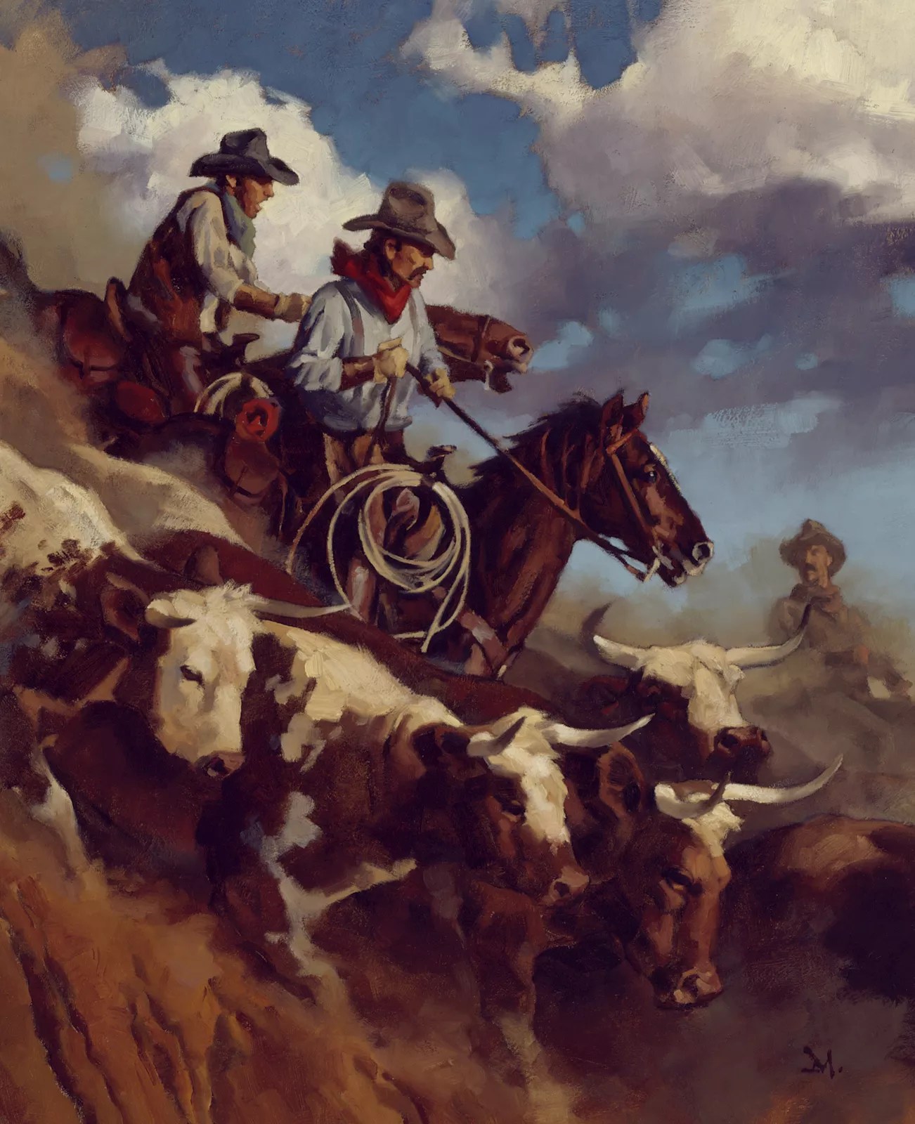
46 paintings are on display for L’Amour by Manchess at the A.R. Mitchell Museum of Western Art.
Gregory Manchess
Now, 46 of those paintings are on display in the largest exhibit (and sale) of L’Amour art ever offered in one place. L’Amour by Manchess opened May 2 at the A.R. Mitchell Museum of Western Art in Trinidad. Manchess pitched the idea last year during another illustrator show at what’s locally known as “the Mitch” – a 1906 building that showcases the iconic, early-1900s Western-themed paintings of Trinidad native Arthur Roy Mitchell along with Indigenous and Hispanic folk art in this scenic, art-obsessed little city that still feels like a cowtown in all the best ways (and also boasts some of the best gravel bike trails and parks in the state).
The show includes some of Manchess’ favorites – including Kilkenny, Milo Talon and a few from the Hopalong Cassidy books – along with several from the legendary Sackett series (the moody and evocative The Daybreakers andThe Sackett Brand among them), which L’Amour wrote during visits to Durango’s historic Strater Hotel, which still has L’Amour’s desk in Room 222. (L’Amour also bought a thousand acres west of Durango in the 1960s.)
“I run into people all the time who still know the L’Amour books, even after all these years,” Manchess says. “They tell me, ‘Oh, my god, my dad read all of those when I was a kid,’ or, ‘My mom still reads them.’ And then as they get older, they go back and read them to find a way to reconnect with their parents.
“They’re like episodes of Bonanza,” he adds. “When you read his books, you can kind of revisit this time period that so many people hold so dear, this mythical time that’s so specific to this country, but that also had this authenticity that brings up a lot of emotion for many of us. And that narrative translates really well, I think, to being captured in an oil painting.”
Louis L’Amour was arguably the most beloved of Western wordsmiths.
Gregory Manchess
At seventy, Manchess – who splits his time between Long Island and Fort Thomas, Kentucky, in the 1870s house he grew up in, which he recently purchased – has had a storied career, as well. His artwork has been featured on postage stamps, movie posters and advertising campaigns, as well as in magazines such as National Geographic, The Atlantic and Smithsonian. His graphic novel, Above the Timberline, was published in 2017; a year later, he illustrated all the chapters of the book seen in the Coen brothers’ film The Ballad of Buster Scruggs. Last year, Manchess was inducted into the Society of Illustrators Hall of Fame, and he teaches illustration at the Smart School and elsewhere.
“What’s funny about teaching now is that when I was in school, I really wanted to paint in oil, but my teachers were all saying that oil painting was dead,” Manchess says. “First, I had been told I didn’t have talent in high school and that I was never gonna get into the art schools, but finally, one school did take me, and then they told me the kind of painting I was passionate about was dead. I was really angry about that, because I wanted to paint in oil in this specific style, like Howard Pyle did. I was deep into that. Those Brandywine guys influenced me so much from my childhood through art school. I was emulating what they were doing, because I just thought the paintings were wonderfully done.”
In fact, the Brandywine School style – whose storybook method of painting focuses on human figures in motion as they relate to a narrative, pioneered by Pyle – wound up being the reason Manchess became the modern-day L’Amour illustrator, following in the brush strokes of early cover artists such as Howard Terpning, Frank McCarthy and Louis S. Glanzman. In the early ’90s, Manchess had sold a title page illustration to the Louis L’Amour Western Magazine, a short-lived publication dedicated to discovering and promoting new Western fiction – one of Beau L’Amour’s many projects, along with trying to change his father’s book covers to appeal to new readers.
“Beau was looking for someone from the Brandywine School, someone who could pull off a more modern feel,” Manchess explains. “Beau had specific ideas about how he wanted to update the covers, and we just clicked, got along instantly. We very quickly nailed down a process that really worked between us, and it helped that Beau had been so familiar with all of the books since he was a child.”

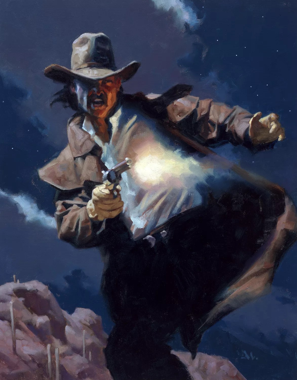
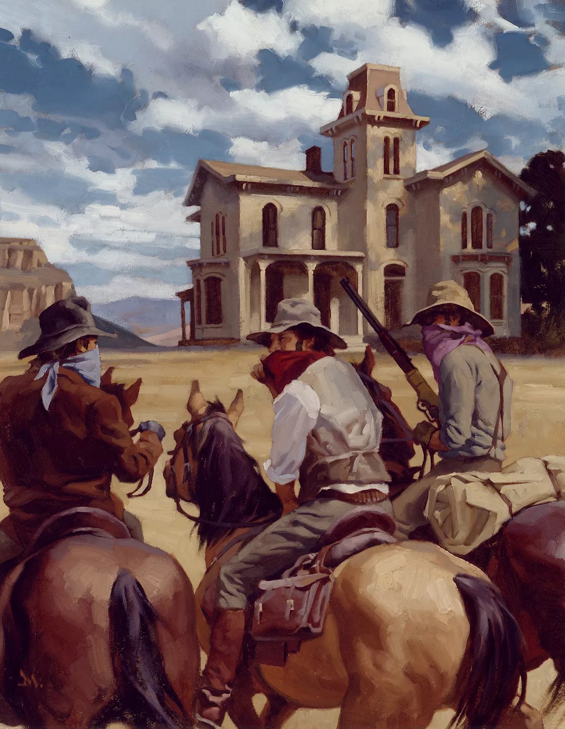
Gregory Manchess painted more than sixty Louis L’Amour book covers.
Gregory Manchess
Because of the sheer number of books, Manchess rarely had time to read them. Instead, the process involved Beau talking through the stories with him. He then came up with thumbnail sketches to start working through what would capture the feel of each. Beau would take a look, and then based on his feedback, Manchess would create larger drawings, and they would narrow the choices down to two or three. After another chat about the options, Beau would know which one was right.
“While we were trying to update the covers, we were facing backward in time,” Manchess recalls. “Not just to the 1860s, but to painters like Pyle and N.C. Wyeth. So we were emulating what those guys had produced as American illustration. We took that and tried to be truthful to the history of it.”
They also endeavored to be accurate in the details, sourcing things like cowboy hats, tack, boots and more to reflect those that had been used in the time of the stories. “You know, back in the ’60s when the original artists were doing these covers, they would have flat hats, like you see in the old TV shows,” Manchess says. “Well, that’s not correct to the time – those guys back in the 1800s had rounded dome hats. They wore specific things like wrist guards and boot shafts, and they tucked their pants into their boots. They definitely didn’t dress like they did in Bonanza.”
Unique to illustrating for a book cover is that the images have to be more vertical, which Manchess saw as a welcome challenge. “In the early days working together, we were still working with the old format of the cover, so the title was either at the top of the book or at the bottom,” Manchess explains. “Now, initially, the reason it was at the top of the book was so they could sit in the paperback stands, and the title would be above the shelf holder. So I would design the entire cover for the image, and then the type would obliterate fully a third of it.”
As merchandising evolved, the need for a title at the top disappeared, and Manchess was given more freedom in how he could place things. It also allowed him to play more with the illusion of movement, resulting in a more dynamic feel to the covers. “What I’m looking for is the character in the body language, even in the animals, like horses and oxen,” he shares. “I’m interested in how they move in the painting itself, how they move in the composition, so I’m constantly looking at active horses and how people move through the landscape. And then costuming comes into play. And I don’t have what it takes to buy all that costuming, so I have to draw it and put it on people.”
Manchess – along with Beau and a few of their friends – wound up serving as models for many of the men portrayed. “That helped with being able to pose the body posture, get the body language right,” he says. “I really tried to work at capturing that feeling of fluidity and motion.”
In addition to giving the cover images more movement, Beau wanted him to rely less on guns as icons of the period. “I thought that was a good approach, because we didn’t want them to look like shoot-’em-ups every single time,” Manchess says. “And also, we just need less of that out there right now, you know?”

The process of painting the book covers involved L’Amour’s son talking through the stories with Manchess. He then came up with thumbnail sketches to start working through what would capture the feel of each.
Gregory Manchess
What he thinks we need more of out there is caution around Artificial Intelligence and its potential long-term impact on artists. Manchess is one of ten artists suing Stability AI in a class action suit aimed at “getting them to stop taking our work off the internet,” he explains. “The whole thing is based on a sampling of the work, the machines can’t create a work from scratch. I mean, it’s all about copyright, we’ve got to get this under control.”
Because Western art often trades on a sense of authenticity and nostalgia, while AI-generated images are built on datasets rather than lived experience or human emotion, Manchess says he worries about the blurring of the line between original and derivative content. “It’s already starting to change everything in the art world, and not for the better,” he says.
His name is one of the twelve now-famous “prompt gods,” and he says he was shocked when he realized how much of his work was being pilfered and used for profit by people plugging in his name to access his work. “I mean, when I first heard about it, my stuff had been sampled upwards of 150,000 times,” he says. “And since then, it’s gone way beyond that. And they’re trying to cover it up, that this is infringing on our ownership of the work we labored over to create.”
He’s heartened by the fact that there are still so many original illustrators plying their craft, though. Manchess says he is excited that the L’Amour collection is being offered alongside another comprehensive exhibit, Character in Context 2025, featuring nineteen other illustrators whose process journeys – from preliminary drawings to color studies – accompany the final artworks, all of which are available for purchase and represent the most comprehensive presentation of processes (more than 150 pieces) from living illustrators ever collected in one space.
“We’re just all going to have to stick together and support each other, and keep fighting until the bitter end to preserve our rights, because otherwise, it’s Handmaid’s Tale, right?” Manchess says.
Which, let’s face it, is a far cry from Bonanza.
L’Amour by Manchess runs through October 31 and Character in Context 2025 runs through July 19 at the A.R. Mitchell Museum of Western Art, 150 East Main Street in Trinidad. Artists include Gregory Manchess, Elliot Lang, Sarah Finnigan, Joanna Barnum, Cody Kuehl, Zak Pullen, Bruce Macpherson, Shawn Adomanis, Reiko Murakami, Tawny Fritz, Kaysha Siemens, Andrew Magrini, Kelley Hensing, Scott Brundage, Patrick Stacy, Dan Chudzinski, Colin and Kristine Poole, and Jennifer Hrabota Lesser. Learn more at armitchellmuseum.com.