
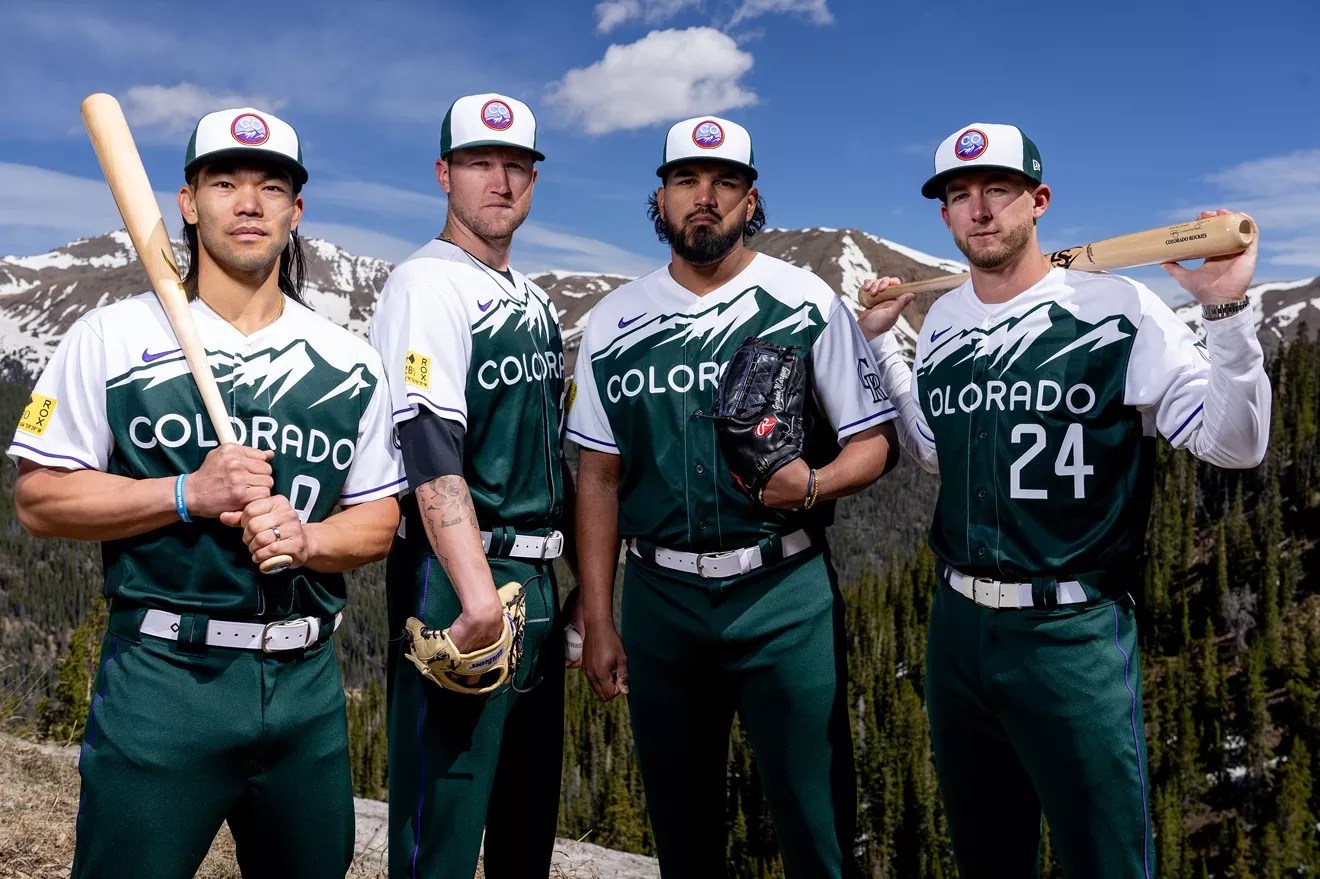
Colorado Rockies

Audio By Carbonatix
When the new Colorado Rockies City Connect jerseys dropped last month, every fan suddenly became a fashion critic. Some think the jerseys, with their Colorado license-plate inspiration, are the best things Denver’s baseball team has ever worn, and ESPN even ranked them at the top of its City Connect list, beating out such stiff competition as the Chicago White Sox City Connect jerseys. But other Rockies fans consider the new City Connect jerseys another embarrassing loss.
The opinions reflect a stark black-and-white divide that’s rare in Colorado, where fans usually unite in their opinion of a sports-team uniform – often a colorful one. Here’s a look at the five best and worst uniforms in Denver sports history:
THE TOP FIVE

Alex English looked dynamite in these uniforms.
Getty Images
Nuggets, Blue Rainbow Skyline
The jersey that the Nuggets wore in the 1980s and early 1990s is the greatest Denver sports jersey of all time, and may be one of the most perfect uniforms ever made. The highlight is the Denver skyline framed by the Rocky Mountains, with a rainbow sky above, which captures the beauty of this city’s setting. The blue base helps amplify the yellow that outlines the numbers and the Nuggets name and circles the sleeves and collar. A bonus is the old-school Adidas logo, which looks much better than the modern-day version.
These jerseys are really the Alex English jerseys, since he was the team’s star for the entirety of the 1980s, when the Nuggets sported these uniforms. They also evoke memories of Dikembe Mutombo, the Congolese giant from Georgetown who played for the Nuggets in the early ’90s. Any fan spotted wearing one of these has instant street cred, in Colorado and beyond.
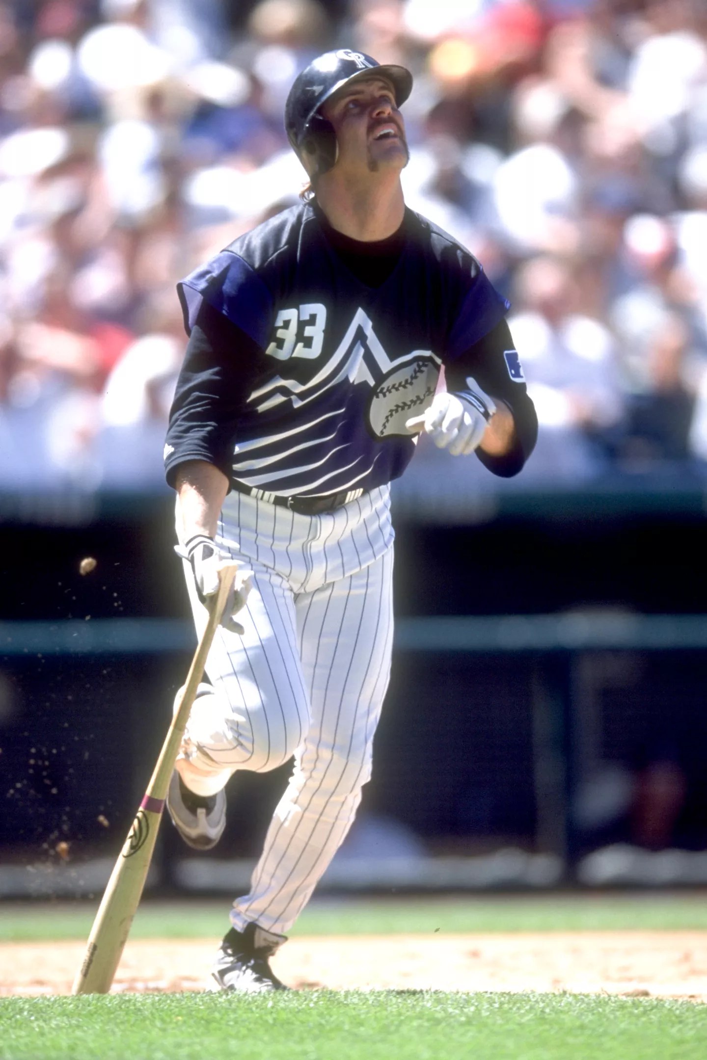
The Turn Ahead the Clock jerseys were the best uniforms ever sported by the Rockies.
Courtesy of the Colorado Rockies
Rockies, Turn Ahead the Clock
The Rockies have worn some of the sharpest-looking jerseys in baseball since the team began play in 1993, and the Turn Ahead the Clock uniforms that the Rockies sported in 1999 remain the best. The snowcapped purple-and-black mountain is absolutely massive and in your face, and the baseball is so huge that you could mistake it for the moon. The black base really makes the rest of the colors pop, and the decision to leave off the sleeves was genius.
These aren’t the types of jerseys that fans can wear to the office before heading over to Coors Field to catch a game; they’re a bit too eye-popping. But Larry Walker sure did look good hitting two home runs, including a walk-off three-run blast against the Braves in August 1999, while sporting this jersey.

John Elway looked sharp in these Broncos uniforms.
Getty Images
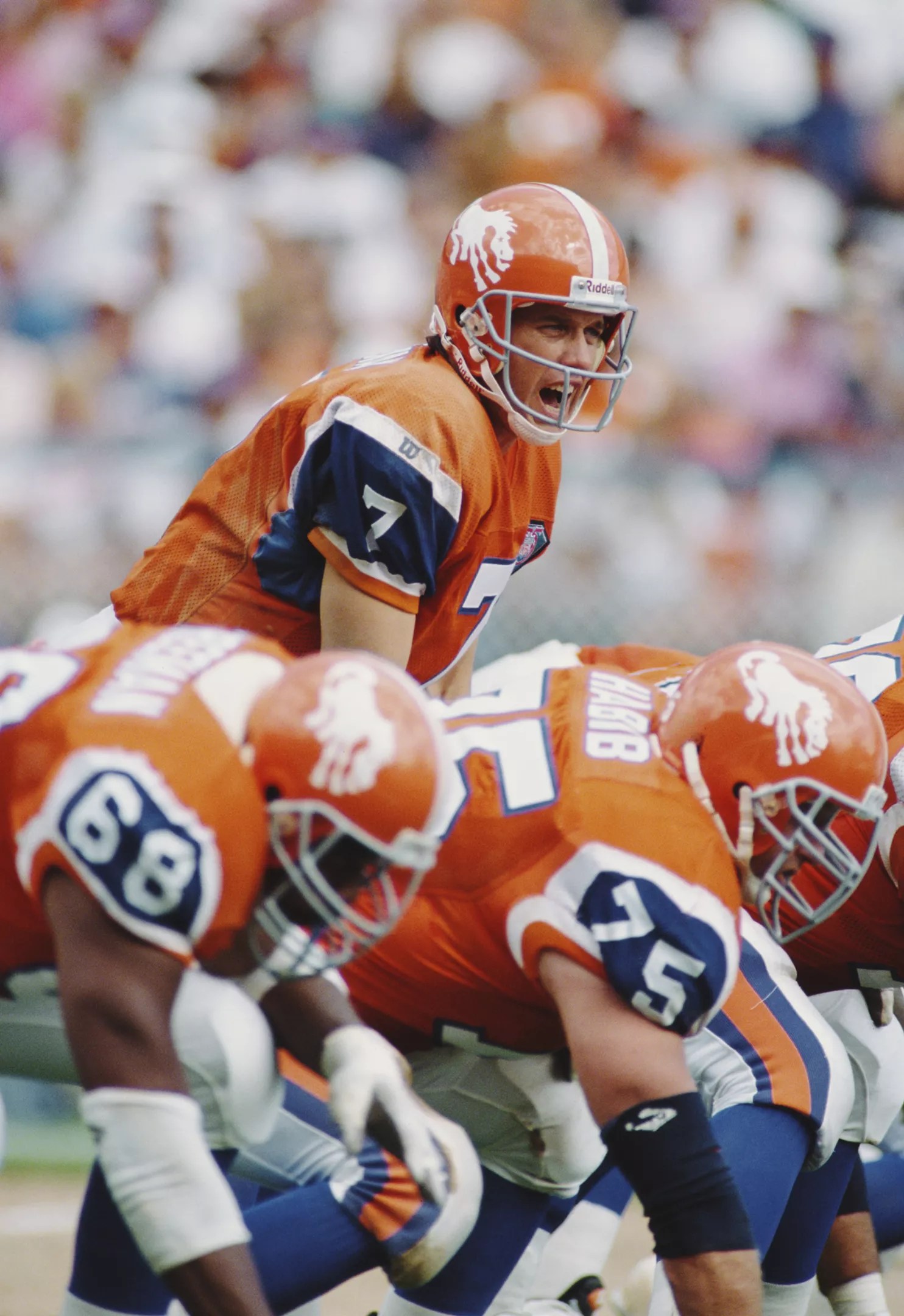
Broncos, Orange and Blue with D on Helmet
From the ’60s through the mid-’90s, the Denver Broncos wore great uniforms with one of the best color combos in sports: orange and blue. And over the decades, as the orange and blue got brighter, the most important element remained: an orange D with a white outline that featured a scary-looking standing horse in the middle.
Since the Broncos retired these uniforms just before John Elway led the team to back-to-back Super Bowl victories, they were never championship jerseys. But they’re definitely winners.
The Rapids made the right choice in going with burgundy uniforms.
Courtesy of the Colorado Rapids
Rapids, 2018 Burgundy Kit
From 2003 through 2006, the Colorado Rapids were rocking some of the ugliest uniforms in sports, which looked like knock-off Inter Milan jerseys that you buy for pennies on the dollar from China. The decision to pivot from these monstrosities to burgundy kits was one of the best moves the franchise has made.
Rapids jersey designers have been fine-tuning the burgundy over the years, and finally crafted their masterpiece in 2018. The Transamerica burgundy uniforms are simple yet elegant. With only two main colors and no white at all, the burgundy-and-powder-blue jerseys let other teams know that a classy squad is on the pitch. The triple stripe down the side adds a little flair, while the Colorado flag at the bottom adds the perfect state-pride touch.
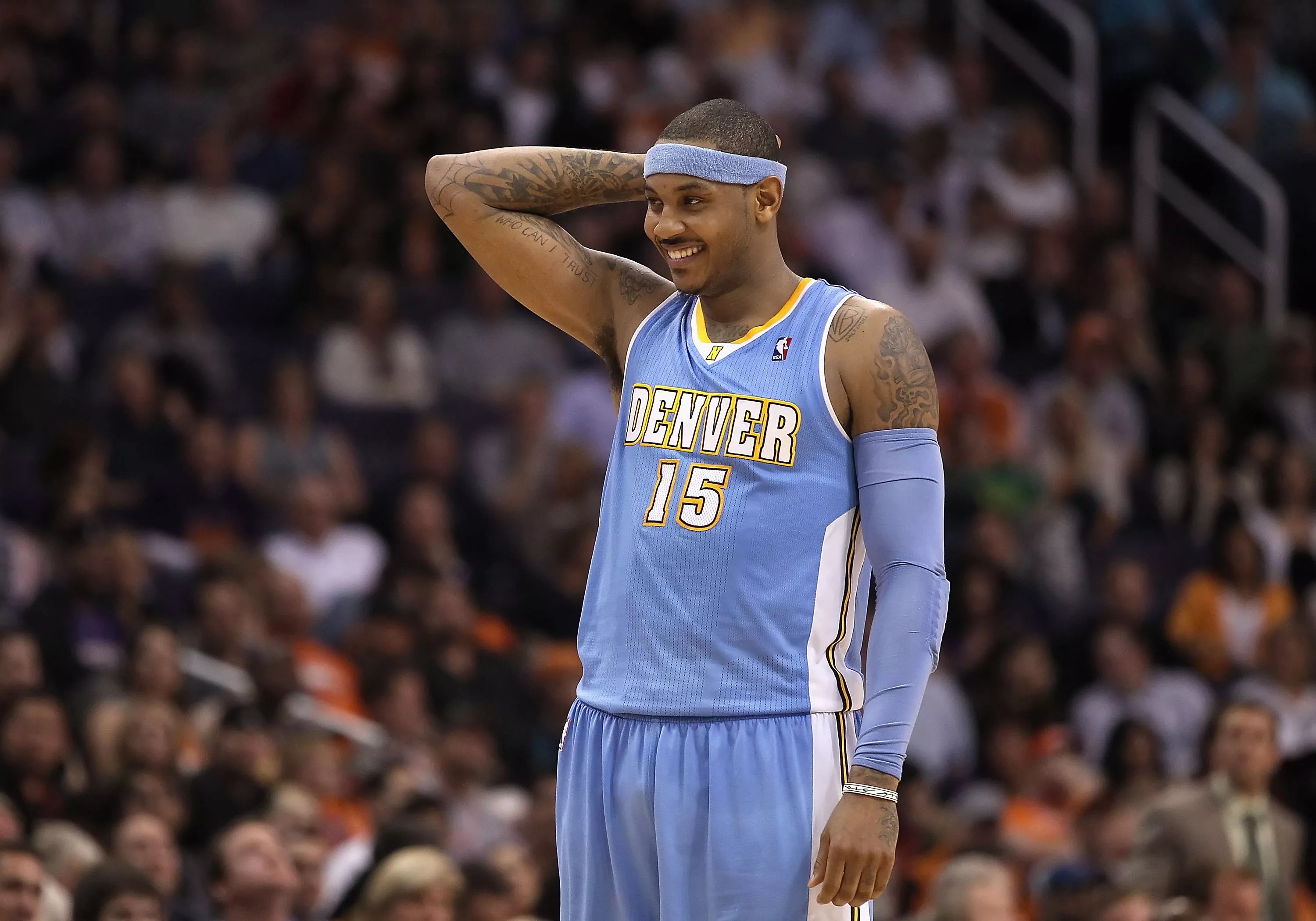
Baby blue and Melo. Good times.
Getty Images
Nuggets, Baby Blue
In 2003, after years of struggling, the Denver Nuggets selected Carmelo Anthony, a freshman phenom out of Syracuse, with the number-three overall pick. That selection turned out to be one of the most pivotal moments in franchise history, as the team found major success under Melo’s leadership,
Coinciding with Melo’s addition to the team, the Nuggets began wearing baby-blue jerseys that quickly became the hippest uniforms in the NBA. At the time, baby blue was in, especially among hip-hop artists; after the iconic Allen Iverson joined the squad in 2006, the Nuggets’ uniforms became a frequent sight on MTV and at concerts, all at a time when the team was balling. Good times.
WORST FIVE
Yuck!
Getty Images
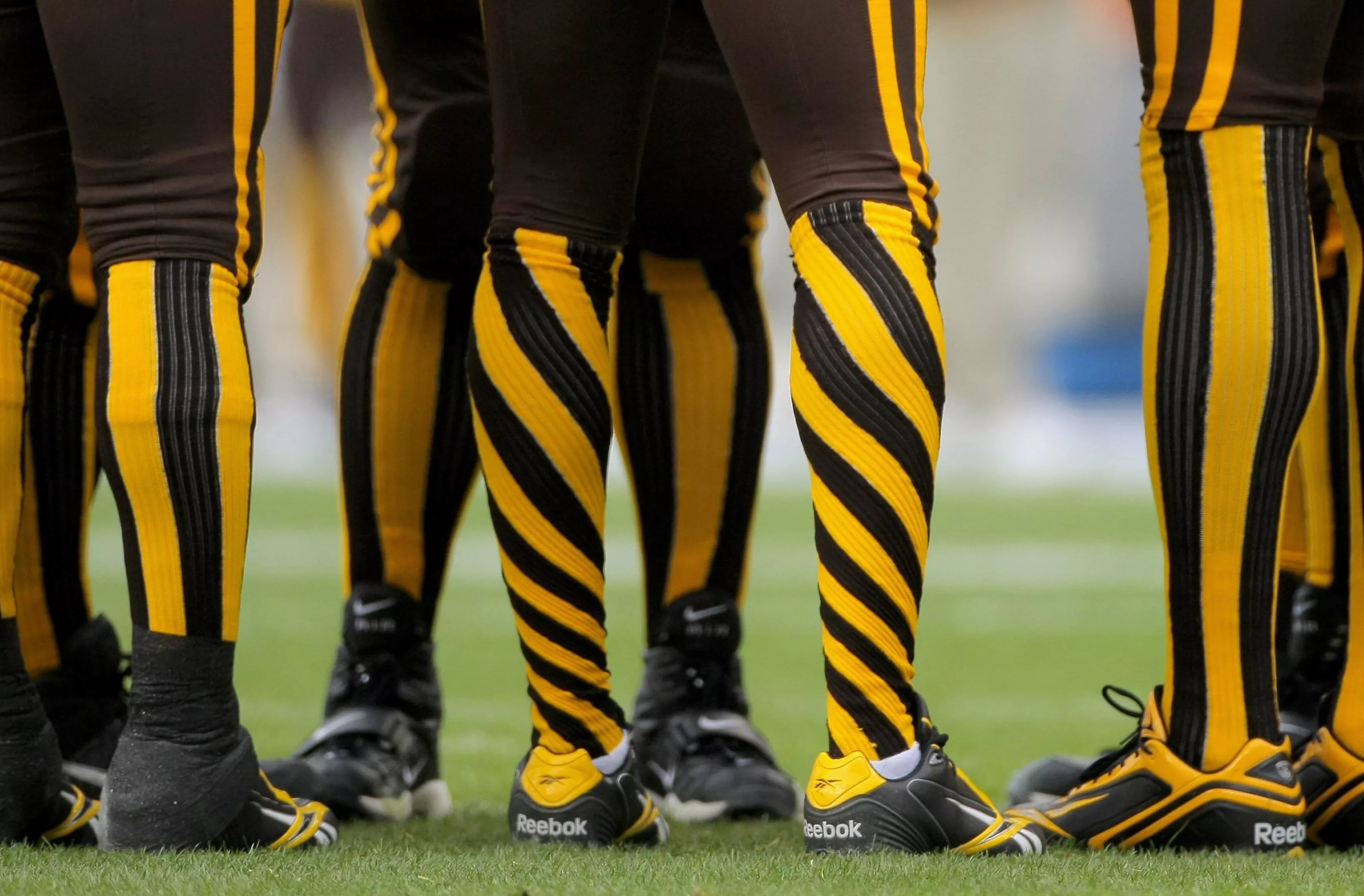
Broncos, AFL Brown and Yellow
Although the Broncos wear some very classy jerseys today, when the Denver team began competing in the American Football League in 1960, the uniforms were hideous. The colors were poop brown and mustard yellow, which may be the most disgusting combination on Earth, and the socks looked like those terrible candy cane flavors left when you run out of not just the traditional peppermint ones, but the berry versions, too.
The Broncos even put two white lines on the helmets, as though the team was counting down the years until the owners would finally wise up and ditch this disaster.
That is one sick-looking horse.
Getty Images
Broncos, AFL Sick-Looking Horse
While the poop-brown Broncos uniforms lasted only two seasons and the team adopted its blue-and-orange color scheme in 1962, that move was almost ruined by the helmets. Yes, it had a horse on the side, but it was a very sick-looking horse. It was frail, leaning over as if about to collapse, and looked like it was ready to cough up ten hairballs. It was the type of horse that made you want to call Denver Animal Protection.
Thankfully, the sick-looking horse stuck around for only five seasons; since then, it has only made occasional appearances on throwback uniforms.

These jerseys are so absurd that you almost have to respect them.
Courtesy of the Colorado Rapids
Rapids, 1999 Green-and-White Kit
The Rapids had some pretty terrible jerseys over the course of the 1990s, and they closed out the decades with the worst. The 1999 kit featured a gigantic RAPIDS on the front with a river splashing through the text. While the green-and-white color scheme wasn’t bad, the diagonal stripes cutting across the jersey turned the uniform into one that would make even kids playing rec soccer upset with how they looked.
With that collar, which screamed soccer in the 1990s, these jerseys would now be a hit at a retro-themed party. But the fact that a professional sports team actually wore them is shameful.

Canary yellow looked terrible on the Nuggets.
Getty Images
Nuggets, Canary Yellow Denver Skyline
In 2012, the Nuggets tried to capitalize on fan nostalgia by bringing back the Denver skyline jerseys. But while the Alex English-era skyline jerseys were great, these turned the original elements into a canary-yellow disaster.
These jerseys were so hard on the eyes, they made fans feel dizzy. Thankfully, the team has phased them out of its jersey arsenal.

Colorado used to have a Rockies hockey team.
Colorado Hockey Rockies
The first Colorado Rockies team was actually the Colorado Hockey Rockies, which played back in the 1970s and ’80s. During this team’s short tenure in Denver, members wore the worst hockey uniforms ever seen in the Mile High City – and that’s saying a lot, since the Colorado Avalanche has never had an especially good-looking jersey.
The logo itself is fairly solid: a blue-and-white Colorado mountainscape with a red-and-yellow C in the middle. But that was the end of the positive aspects. Yellow and red stripes were added to the dark blue base color of the jersey and the helmets, and the color combo just didn’t work.
So it was no major loss when the team left Denver for New Jersey and became the Devils.
HONORABLE MENTION
The Quebec Nordiques, which later became the Colorado Avalanche, had some gorgeous uniforms.
Getty Images
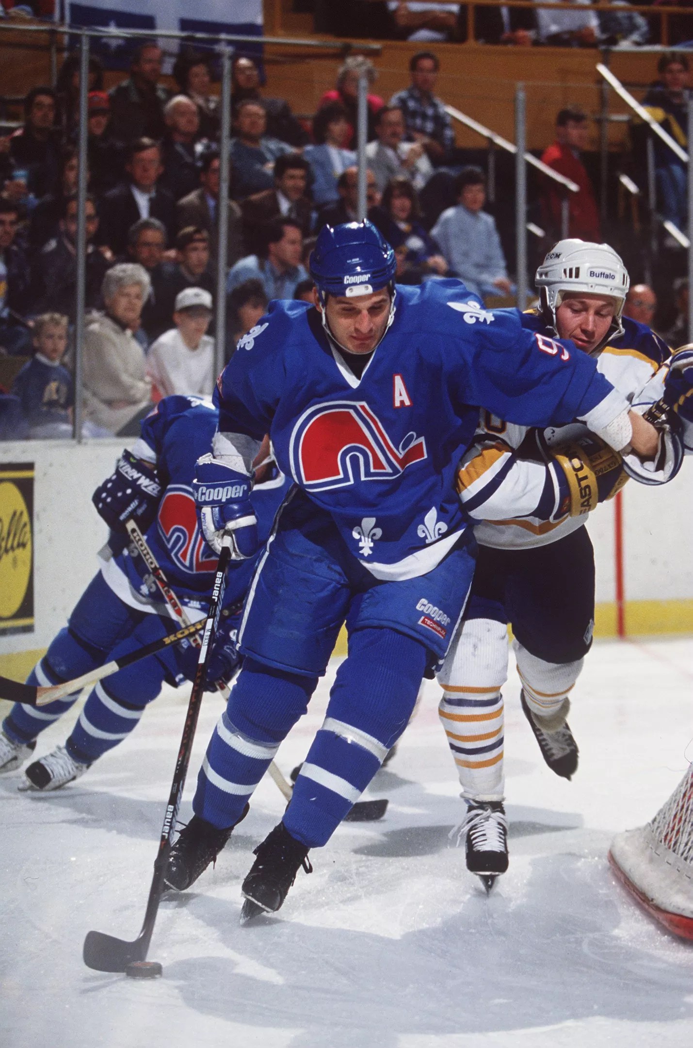
Quebec Nordiques
The Colorado Avalanche has never had a great uniform. But the franchise itself, which started as the Nordiques in Quebec City, sported an incredible jersey when the team was playing in Canada. It had a cleverly designed N with a hockey stick slapping a puck that almost looked like an elephant. The red-and-blue color scheme looked great on ice, too, and in an homage to French Canadian culture, the jerseys included a smattering of fleur-de-lis along the bottom.
It’s a shame that the Avalanche hasn’t been able to come up with jerseys as good as these. They’d look great when the team wins the Stanley Cup.