
Robert Delaney

Audio By Carbonatix
The sculpture scene in Colorado clearly takes a back seat to the state’s vast painting scene, an inequality that has been evident for a least a century. This doesn’t mean that there weren’t, or aren’t, talented sculptors working here, just that there aren’t enough of them – which makes the coincidence of two Denver solos dedicated to contemporary masters all the more special.
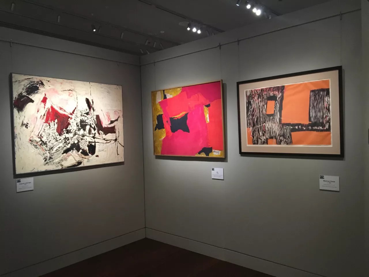
The first is Barbara Locketz: Form. Color. Texture. at the Kirkland Museum of Fine & Decorative Art. As a working artist in Denver, Barbara Locketz hit her peak in the 1960s and ’70s; as a result, her work is not well known to contemporary audiences. Kirkland director Hugh Grant is attempting to fix that by presenting the artist’s first-ever retrospective. Sadly, Locketz, who died in 2017, will not see the final exhibition, which was co-curated by Grant and Chris Herron. However, she was aware that it was being done in her honor and participated in the initial preparations for it. In my many years of viewing art in Colorado, I’d only seen a handful of Locketz pieces, so it was interesting to get an in-depth look at her career, which reveals not only how talented she was, but also how advanced she was for her time.
Locketz’s influences are apparent throughout. Her first mature phase is made up of abstract-expressionist canvases done in the early 1960s in a style not incompatible with that of her early mentor, Vance Kirkland, with whom she studied at the University of Denver. Several of these are very nice, but one definitely stands out: “Untitled,” from 1963, in which Locketz uses blocky shapes evocative of rock formations or small buildings running across a light-colored desert-y ground, brilliantly putting a regional spin on abstract expressionism, which was an international movement by that time.
The next phase, which coincides with Locketz’s time as a student of Robert Mangold’s, marks a notable change in her approach. She began creating paintings covered in a profusion of thin metal plates nailed down onto panels as though they were collage elements. For 1965’s “Amalgam Limited #7,” a densely composed abstraction, Locketz laid roughly cut thin sheets of metal next to and atop one another, so that they read like spontaneous brushstrokes. The overall character of these metal paintings is disarmingly simple yet very sophisticated.
Locketz really hit her stride in the late ’60s and early ’70s, when she made freestanding sculptures that were essentially those metal collages freed from their grounds. But they were also much simpler, with just a handful of metal plates used to carry out each one. They are also more finely crafted than the nailed-metal paintings, with meticulously done joints between the metal components. An impressive early work of this type, “Metal Dimension #2,” from 1967, is made from joined stainless-steel sheets placed parallel to one another like a stack of paper set on end. More luxurious are pieces such as 1967’s “Multiple Variation III,” in which Locketz set stainless steel against polished bronze, creating a silver-and-gold palette.
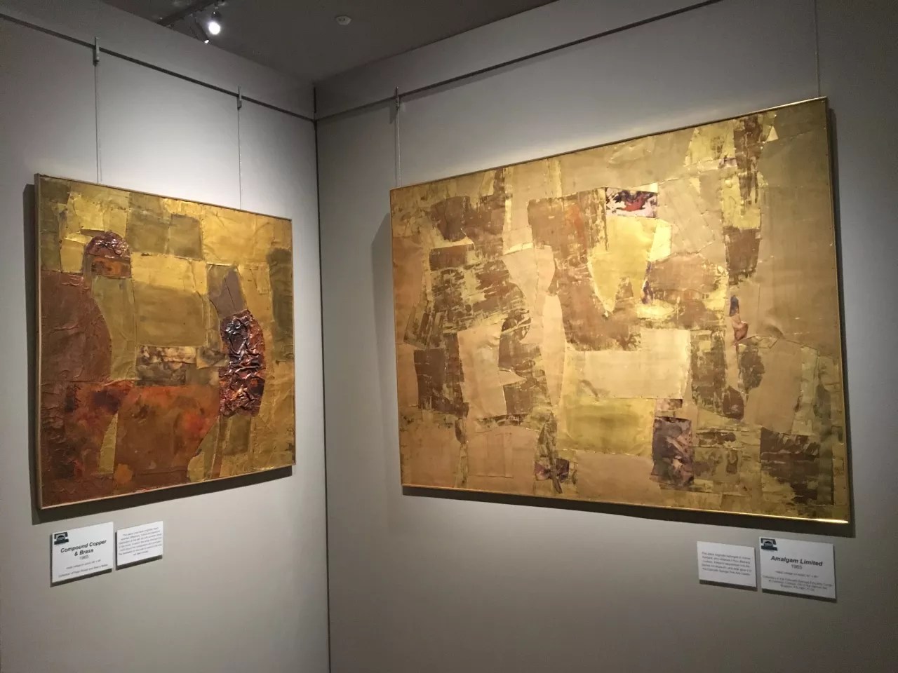
Barbara Locketz’s metal-plate collages at the Kirkland Museum
Robert Delaney
Those metal-plate sculptures led Locketz in two distinct ways. First, she created sculptures made of transparent plastic panes in various colors cut into op-art designs. The forms Locketz used in her sculptures are fairly geometric, a break from her earlier, more organic shapes. For “Mexico Red & Blue” from 1971, she set a red sheet on a black one, with a blue oval above a blue circle. These Plexiglas works have a disco flair because of their strong colors and the notion of making plastic sculptures to begin with. Then, in the 1970s, Locketz became an accomplished jeweler, translating the basic shapes she had done in the plastic pieces and miniaturizing them and simplifying her compositions even further. These miniatures in gold, silver and cast acrylic – in particular the pendants – have an architectonic quality, like models of op-y bas-reliefs for the side of a building.
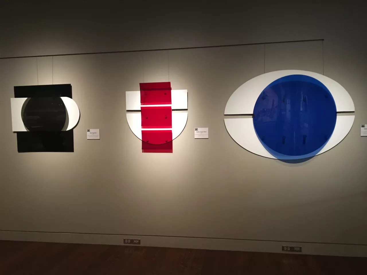
Plexiglas wall sculptures by Barbara Locketz at the Kirkland Museum
Robert Delaney
Locketz arguably found her greatest success with her jewelry, which was sold in New York and London in galleries that also showcased the work of acknowledged masters such as Alexander Calder and Roy Lichtenstein. It was also displayed in national magazines including TIME. For some viewers, Locketz’s jewelry – which, though decades old, still manages to look new – might be the most compelling part of the Kirkland show. Sadly, by the mid-’70s, Locketz stopped working in art altogether.
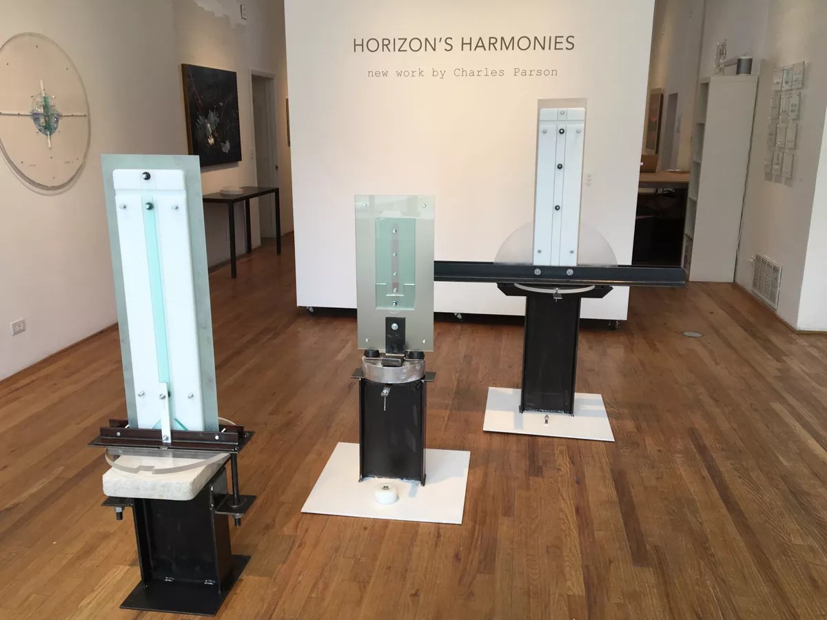
It was about that time that a young artist named Charles Parson, recently out of graduate school, arrived in Denver and began a forty-year career as an art teacher at various local colleges and a conceptual artist specializing in sculpture. Interestingly, Parson’s industrial aesthetic is not too far removed from Locketz’s approach, with both interested in making bold, straightforward statements through materials and bare-bones compositions.
Installation view of
Robert Delaney
Horizon’s Harmonies: New Work by Charles Parson, at Mai Wyn Fine Art, comprises a small selection of Parson’s work. Though it’s hard to see but easy to understand, Parson intends for his work to respond to the landscape, though he uses very unnatural elements, such as steel beams, chrome-plated hardware, plate glass, polished stone and cast or cut acrylic panels, to do it.
The show is anchored by a trio of signature Parson sculptures from his “Floating Horizon” series. These works are predominantly rectilinear and accented with the odd circles and half-circles; all three take the shape of spires and so have a totemic quality, though there are no direct references to anything recognizable. Instead, Parson orchestrates the ready-made materials into constructivist stacks that rise from the floor. The palette of these works is very quiet – dominated by black and white, and accented by silvery touches from the hardware and the natural shades of the flat stone slabs.

Plexiglas and canvas wall reliefs incorporating drawings by Charles Parson at Mai Wyn Fine Art.
Robert Delaney
Wall pieces – hybrids of drawings and sculptures – bring the relationship between Parson’s work and the landscape to the forefront, even if the depictions of it are set behind the sculptural elements. Here he has drawn iconic scenic vistas using colored pencils on canvas; although Parson is into pure abstraction in the main body of his work, these drawing are done in a realist style, even if the details are surreal. On top of the drawings, he’s laid a screen of Plexiglas and hardware in a constructivist arrangement, and with that small gesture connects these meticulous drawings to the beefier character of his other work.
The coincidence of the Locketz and Parson shows makes me think that somebody should do a ’70s art show, stat.
Barbara Locketz: Form. Color. Texture, through July 14, Kirkland Museum of Fine & Decorative Art, 1201 Bannock Street, 303-832-8576, kirklandmuseum.org.
Horizon’s Harmonies: New Work by Charles Parson, through April 13, Mai Wyn Fine Art, 744 Santa Fe Drive, 303-893-4182, maiwyn.com.