
Molly Martin

Audio By Carbonatix
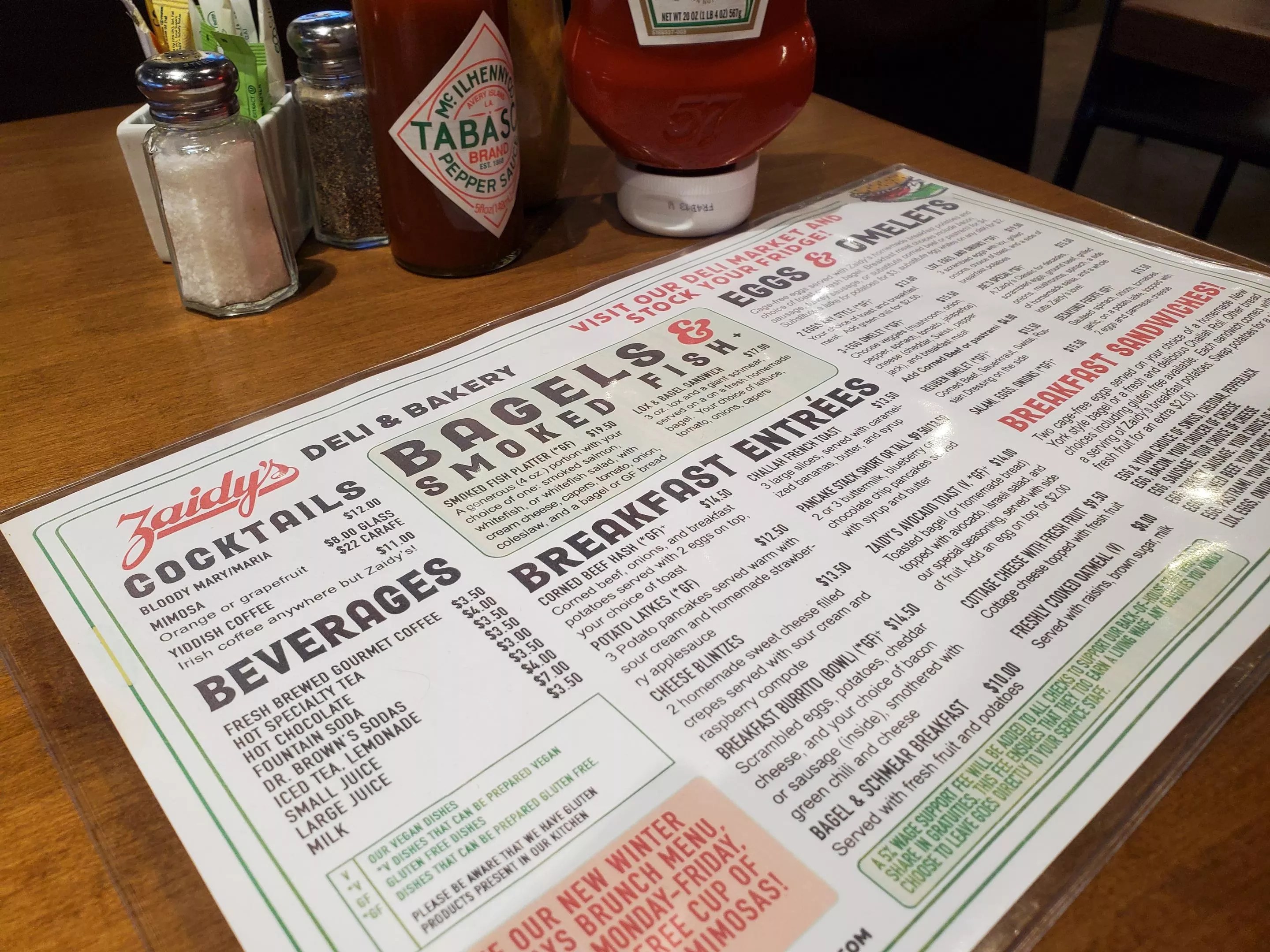
Joel Appel can get a little obsessive over the menu at Zaidy’s – not just what food is listed on it, but how it’s listed.
That’s understandable, since his career started in brand marketing, where he worked on accounts such as Quaker Oats, Cap’n Crunch and Gatorade before launching OxiClean with his father from the family garage in Littleton. And his family loved Zaidy’s, the local Jewish deli that was located in Cherry Creek and had been a Colorado staple since 1985.
“Zaidy’s was always a place for the Jewish community in the area – young people having their graduation lunches or mitzvah dinners,“ he recounts. So when Zaidy’s closed during the pandemic, Appel and his partners (including his father and Beth Ginsberg, owner of Trompeau Bakery) decided to buy it. The revamped Zaidy’s opened in a new, bigger location at 600 South Holly Street in August 2021.
The partners wanted to keep the classic Jewish deli vibe and food, but in a modernized way, and they wanted the new menu to reflect that. So Appel went to Elke Barter Design and “I basically gave her this mission: the deli of the future,” he recalls. “Hang on to some of the feel of the old, a little bit of a vintage-y script, but make it modern and fun.” The number of items was cut to a third of the original size, and the team moved away from the omnipresent country-club green that was everywhere at the original Zaidy’s, though they made sure to keep the color as an accent.
It’s not obvious to the average consumer, but a lot of thought goes into every aspect of a restaurant’s menu design. There’s how the items are grouped, for example. “We used to put our sandwiches in two different categories, ‘Classic’ and ‘Deli,’ before combining them into ‘Deli Classics,'” Appel notes.
“Oh, and we used to have this dish under the ‘Bagels and Smoked Fish’ section, but no one could find it,” he adds, pointing to one listed as “Lox, eggs and onions.” Now the combination of three scrambled eggs and lox can be easily located under the “Eggs and Omelets” section.
Then there’s the menu descriptions themselves. “I would love to – what we say in Yiddish – schmaltz it up,” Appel explains. “But it’s a balance between how much space do we fill up on the menu so that it looks really crowded, shrinking the fonts, and just spending hours and hours thinking, ‘Should we say it’s fresh? Should we mention it’s straight out of the oven?'”
Then there are unexpectedly important details, such as when Zaidy’s left the word “seeded” off the description of its French dip sandwich bread and ended up having to reprint it after guests complained.
Plus, Appel notes, “you can also tilt your menu to [highlight] the more profitable items, which is a really big deal today” – and a common practice, especially for corporate chains. “I don’t really believe that,” he adds. “I figure I sell the items the customers want to buy and they’ll keep coming back.”
There’s a bit of playfulness on the Zaidy’s menu, too, such as listing its “Famous Matzo Ball Soup” priced at “$7.50 Bowl Only (Too Big for a Cup!),” but for the most part, the design is functional – appropriate for a busy Jewish deli where the booths are filled with families stopping in for a sit-down breakfast or grabbing something to go at the deli counter.
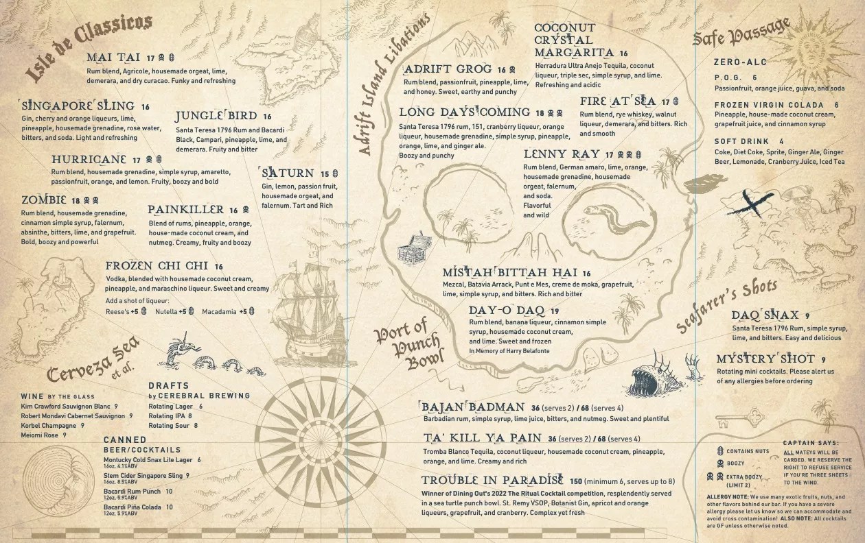
Adrift’s map-inspired menu.
Adrift
Then there’s Adrift, which has made its menu a statement piece. The tiki bar, located at 218 South Broadway, shares owners with the Little Man Ice Cream group. “The concept behind Adrift’s menu design was born out of my vision to transport our guests to a faraway island, allowing them to momentarily forget their landlocked surroundings,” explains owner Loren Martinez. “Our guests should be…Adrift.”
The bar worked with Orr Design to create a menu that looks like an old-fashioned treasure map, with its Singapore Sling and Mai Tai sitting on the “Isle de Classicos” while the Trouble in Paradise cocktail – winner of the 2022 Dining Out Ritual Cocktail competition – appears in the “Port of Punch Bowl.” The menus themselves look like, and have unintentionally become, keepsakes; laughing, Martinez admits that patrons often sneak them out of the bar.
The food descriptions at Adrift go beyond calling out ingredients. “I wanted our menu to be more than just a list,” Martinez says. “I aimed to make it an experience. … Each dish is not merely listed, but narrated,” using active verbs, adjectives and sensory appeal. For example, Spam musubi is listed simply at other local spots such as Poke House (“grilled Spam wrapped in rice and seaweed paper”) and Ohana Island Kitchen (“a Hawaii staple”). At Adrift, it’s “marinated seared Spam and white rice wrapped in seaweed with a splash of sumiso sauce and sprinkle of furikake.”
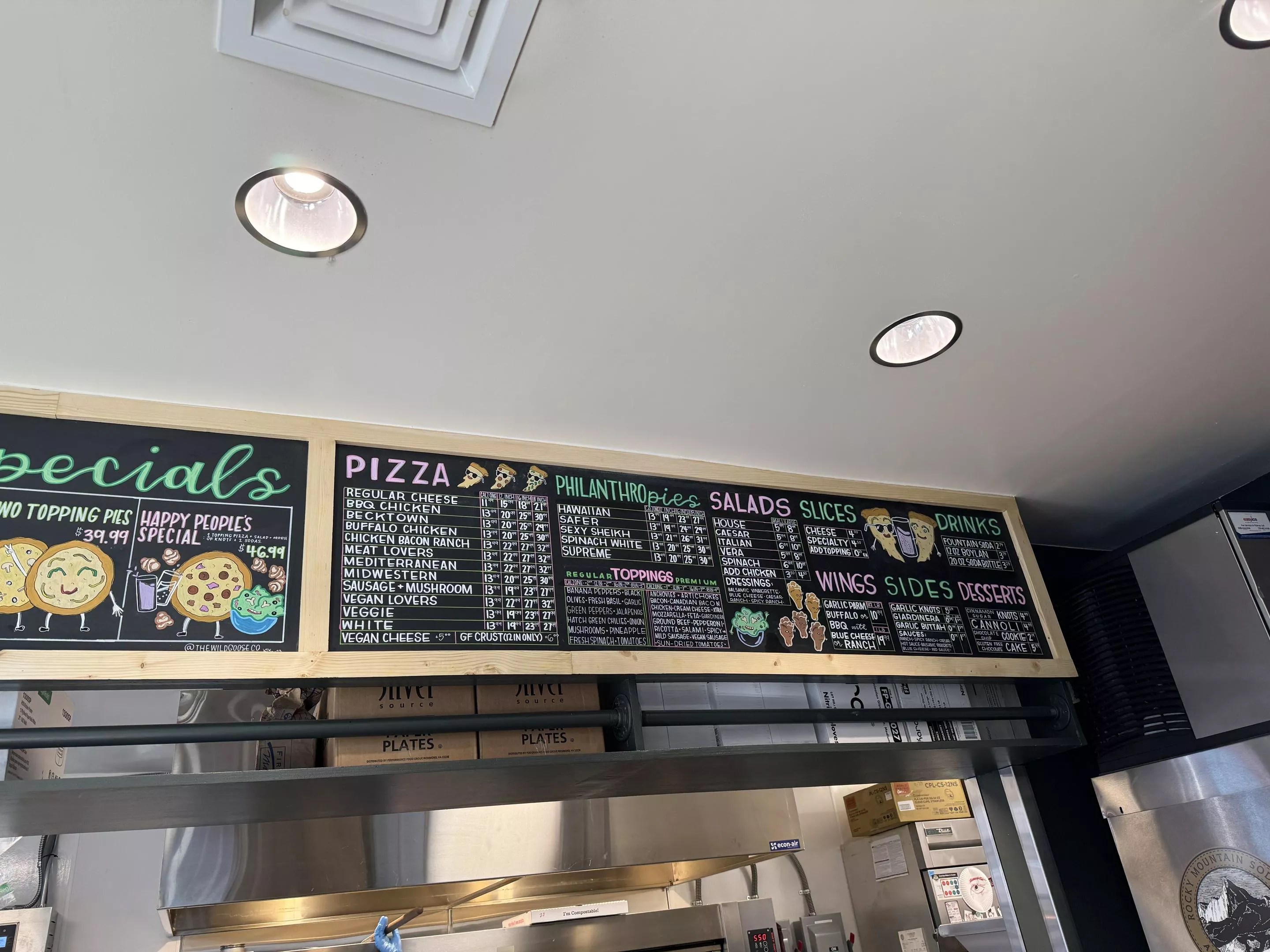
Sexy Pizza’s chalkboard menu.
Helen Xu
Sometimes an eye-catching menu isn’t printed on paper at all. The chalkboard menu at Sexy Pizza’s new Capitol Hill location uses a neat, orderly grid design with a healthy smattering of funky pizza-themed characters and emoticons designed by Becca Waugh, the owner of Sleepy Panther. She started working for Sexy Pizza seven years ago, after answering an open call on Facebook for a chalkboard artist.
“Sexy Pizza is a very fun, funky brand. They gave me baselines of wanting forest creatures and the brand palette being bright pinks and greens and oranges,” Waugh says. The owners “like the cult-classic kind of movies and sci-fi, so I just took all those influences. But the number-one thing is to be able to read the menu. From there it’s kind of just working around and zhuzhing it up, making it look appealing.”
Sexy Pizza also has traditional laminated menus at some of its other locations that follow the same hot-pink, funky, cool vibe. But no matter how fun and funny the menus are, they can be a logistical burden. Staff continually need to print more paper menus as they get worn out or when changes are made. Specials and seasonal items need to be separately printed either on inserts or table tents, and any printing mistakes restart the whole cycle.
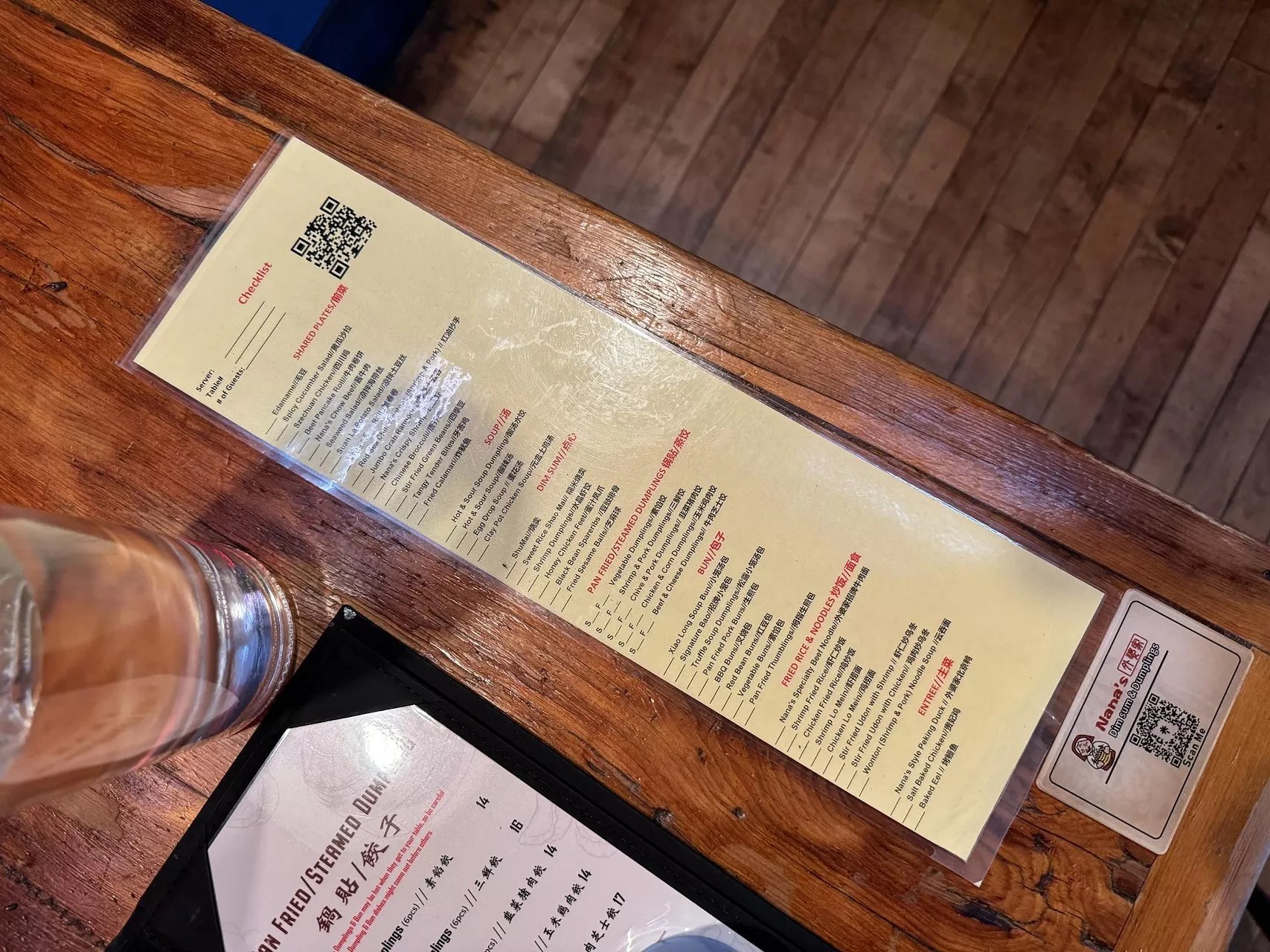
Nana’s has laminated ordering sheets plus a QR with access to descriptions and photos of dishes.
Helen Xu
With so much price fluctuation in recent years, printing menus has become even more challenging, and it’s especially tough for newer businesses that are making even more frequent item changes. At Nana’s Dim Sum and Dumplings, which has opened three locations in the past six months, “we were throwing away hundreds [of menus] every night,” says David Deicola, general manager of the busy LoHi outpost. “And with the price changes, they weren’t matching our Toast [point-of-sale] system, so it was constantly causing conflicts.”
Nana’s previous menus were leather-bound and reminiscent of traditional, formal Chinese restaurant menus. Now there are QR codes taped to every table, which has had benefits beyond eliminating waste. “Our customer base really enjoys the fact that they get to see pictures of the food,” Deicola notes. Since the change, the ordering process has sped up by several minutes per table, and sales of particularly visually appealing dishes, such as stir-fried green beans and crab wontons, have surged.
But Nana’s still has a printed component, too. Its dim sum menus are laminated sheets of paper so that guests can quickly tick off the items they want all at once. It does plan to eventually bring back the leather-bound menus, as well. “Not for every person, but every table will get one. It’s what the owners want; it helps [the experience] to feel more upscale,” Deicola says.
Back at Adrift, creating a certain feel is the focus as well – the feel of being on vacation. “We want [customers] to unplug and genuinely connect – no TVs, no digital ordering tables,” Martinez notes. “Physical, printed menus are part of the experience we deliver.”