
Denver Broncos

Audio By Carbonatix
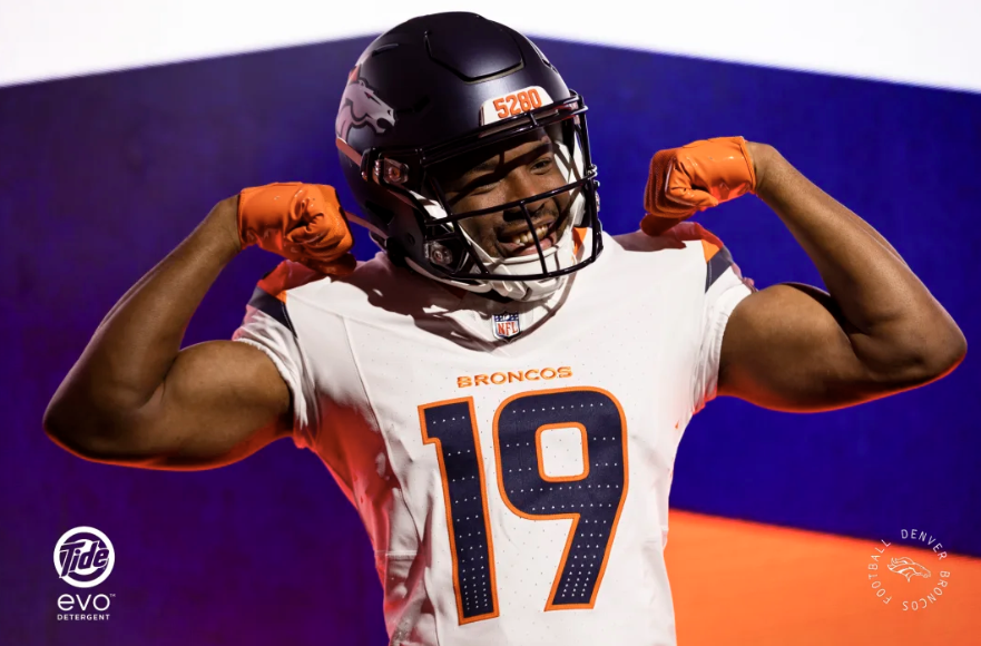
After teasing a uniform redesign last month, the Broncos unveiled their new jerseys on April 22.
And they are terrible.
Announced in a hype video that looks like every SUV commercial in the last five years, the so-called Mile High Collection is underwhelming and confusing at best. It’s the first time since 1997 that the Broncos have released a new uniform set, and it’s the seventh new uniform in franchise history.
“They look like they were made to be sold on the clearance rack of a Walmart,” wrote X user Ezekiel Duprey.
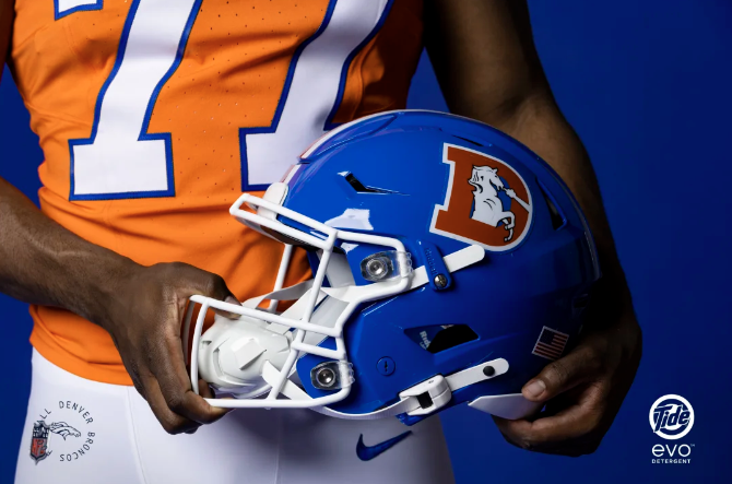
Members of the Walton family bought the Broncos in 2022 and reportedly began immediately working on this redesign. The result is home orange, away white and alternate navy uniforms, all of which come with matching pants, with white and navy helmets that sport the modern horse-head Broncos logo.
Overall, the uniforms have very little to make them stand out from previous iterations, especially since most of the details either simplified the look or are so tiny that no one can realistically interpret them.
Still, the Broncos are happy with the response so far.
“We knew going into this the feedback was going to be mixed,” team president Damani Leech said at a press conference. “I’d say I was pleasantly surprised. It’s not mathematic at this point, but it certainly seems more than half of the sentiment online has been positive.”
When the team announced the jerseys were coming, Leech said the new design is the culmination of work by the owners, players, head coach Sean Payton and fans. In a Broncos story detailing the process of creating the uniforms, Leech said the group went through double-digit iterations before landing on the final design.
I have to wonder how bad the other iterations were if this is where they ended up.
New Broncos Uniforms Are a Snooze
Aside from a weird triangle motif, my biggest qualm with these jerseys is their dullness. They’re giving beige minimalism despite being orange and blue. Although they are distinct from the last Broncos uniform set, they’re still not particularly original.
Do these pants remind you of the mountains?
Denver Broncos
According to the Broncos, the team “wanted more than a slight tweak to the previous uniform design.”
Yet Leech also admitted, “it’s not a dramatic departure from where we’ve been.”
Maybe there was disagreement between going bold and staying safe. Or maybe the designers of these uniforms got so in their own heads that they didn’t realize what a letdown their final product would be.
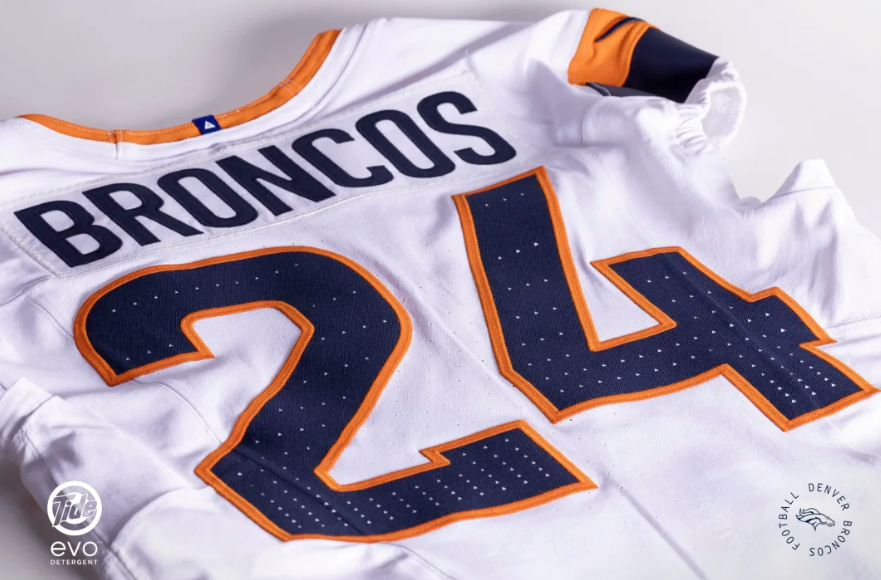
The second seems more likely, as the team has gone deep into the details. Even the lettering for the numbers and names, which any casual observer would likely describe as ‘basic,’ is apparently intended to be iconic.
“Numberset takes design cues from our current look, merged with a more classic block-style to create a modern font that’s recognizable as the Broncos,” the team said in an announcement cataloguing the details of the jerseys.
It would blow my mind if a single person, including those who worked on the design, could identify this font as the one on the Broncos jersey if it were used in any other context. It’s that indistinct.
According to the organization, the font has rounded interior corners to reflect National Park Service signage, so even by its own admission, the font isn’t unique.
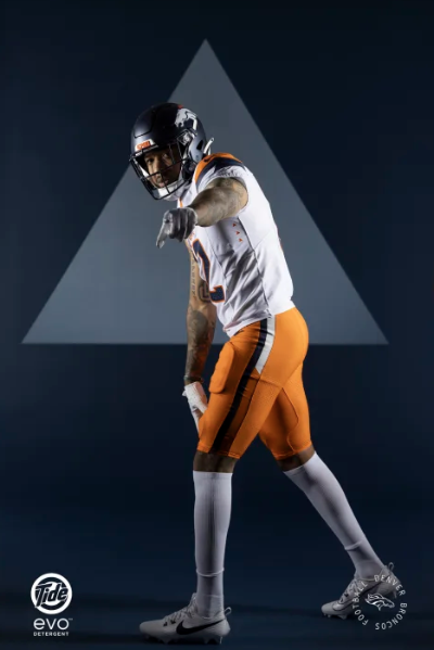
Instead of the previous jersey swoop into pants, the new pants have an uninspiring stripe divided into two colors, with one color going all the way to the bottom and the other stopping at the top of the thigh.
Allegedly, the stripes “feature sharp edges as a nod to the Rocky Mountain peaks.” But aren’t all straight lines, by definition, sharp-edged? Anyone who can provide me with someone who looks at these stripes without any explanation and says “That reminds me of the Rocky Mountains” gets $500.
Triangle Theme Doesn’t Make Sense
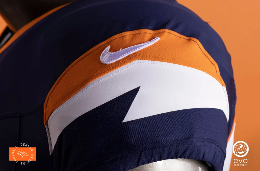
Many of the details on the new jerseys use triangles. There are triangles in the numbers that go from crowded at the bottom to thinned out at the top to represent the thin air in Denver. The idea is way too esoteric for NFL jerseys and is barely noticeable unless you zoom in. For anyone watching on TV or in the stands at Empower Field, these won’t have a visual impact at all.
This is a signature font, people!
Denver Broncos
“Pretty early, we liked that,” Leech said of the triangles in the Broncos’ account about the design process. “Now, where it showed up and all that iterated [was to be decided], but I think we loved the idea of that.”
Nothing against triangles, but I’m really baffled as to how anyone could love this idea.
At the press conference, Leech said it was Nike that pushed the triangles as a design element.
“When we started saying we wanted this to be authentic to our city, state and region, they started pulling in a bunch of visual references for us,” he said.
It’s odd to hear that authenticity came from an out-of-state corporation.
In particular, the armpit triangles stand out as the worst design element in these jerseys. Under the arm of each uniform, three triangles line up pointing toward the armpit. Perhaps the Broncos forgot that triangles are also the shape of arrows? As is, the triangles look as if they’re pointing viewers to check out the sweat stains of the athletes.
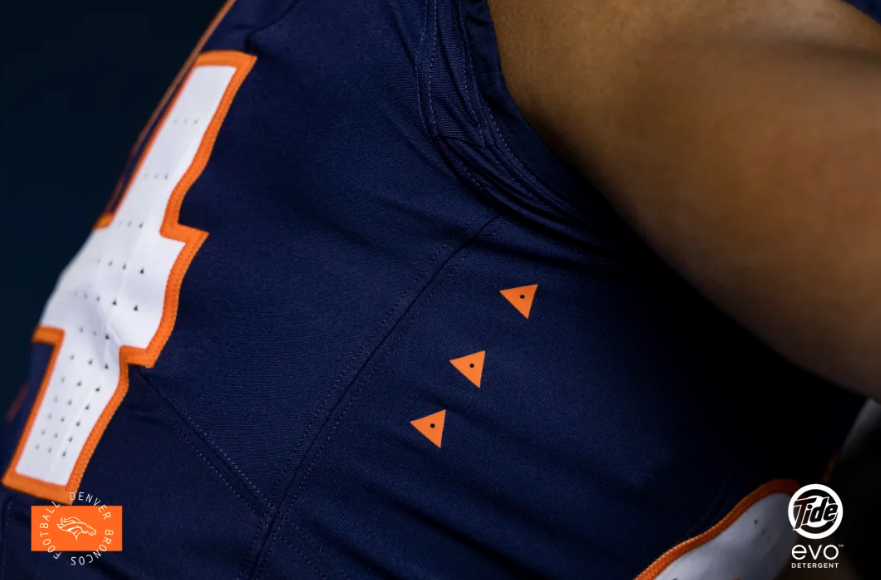
The armpit triangles are a tribute to the three former Super Bowl-winning Broncos teams.
Denver Broncos
“Triangle perforations under the sleeve not only more-boldly convey the thinning air at higher elevation, but are also a nod to Colorado summit markers, outdoor performance gear aesthetics, and a connection to the legacy built from our three Super Bowl Championships in 1997, 1998, and 2015,” the Broncos explained in a post on X.
The helmets also have triangles in a stripe going from the bottom of the helmet to the middle of the top to represent Denver’s peak in elevation. How the triangles accomplish that, I’m really not sure.
But the triangle that upsets me the most is the one on the back neck label.
“Triangle back neck label is inspired by the iconography of summit markers found in Broncos Country and signifies striving to reach the peak,” the team said on X. “It is applied using webbing material, reminiscent of outdoor performance gear.”
Congratulations, rock climbers and fanny pack enthusiasts: The materials you use every day and never think twice about are now sported by the Broncos. Underneath that triangle, stitched into the inside of the neck, are the words “Broncos Country.”
The team has repeated in its messaging that it wanted the jerseys to be for its fans, dubbed Broncos Country. But then why is the homage to its fans hidden in a part of the jersey that will never be seen?
Elements of Broncos Jerseys Reflect Other NFL Teams
The new Broncos sleeve caps are supposed to signify mountain peaks.
Denver Broncos
The sleeve caps on the jerseys include a jagged line, which signifies mountain peaks, according to the team. The cool part? It’s the same line found in the jaw of the horse in the logo. The bad part? At first glance, it looks like the lighting bolt sported by division rival the Los Angeles Chargers.
It also reminds me of Pride Rock from The Lion King, but if I look hard enough, I can kind of imagine it as Red Rocks, too.
However, the orange uniform looks like a Cincinnati Bengals jersey because the navy blue is dark enough to be confused for black, replicating a tiger stripe on the sleeve. Truthfully, I can imagine the orange and white versions on the Cleveland Browns, too. There’s just not anything to distinguish the Mile High Collection from any other NFL jersey.
The distinctive Denver element people can recognize without being a triangle detective is the 5280 on the front of the helmets – but I’m tired of that number being the Denver calling card, especially considering there are plenty of other cities that sit a mile high in elevation (hello, Albuquerque).
Just Make Throwbacks the Main Jerseys
The Broncos also released a throwback to their 1977 uniforms, which the team sported the year it won an AFC Championship and made the playoffs for the first time. Though it went on to lose in the Super Bowl, that team included the infamous Orange Crush defense and will always hold a special place in Broncos history.
The Broncos also added these 1977 throwbacks.
Denver Broncos
Yes, please!
These jerseys don’t require a magnifying glass to see what sets them apart. They are clean, with matching pants and sleeve cap stripes in the sky-blue color the team has dubbed “legacy blue.”
And they remind fans that the Broncos can play good football despite its recent losing ways. They could use that reminder considering the Broncos just traded for a first-round flop in former Jets quarterback Zach Wilson.
Plus, the throwback uniforms will include the classic “D” logo, which is what the team really should have brought back for its helmets in this redesign (though it apparently surveyed 10,000 fans who preferred the horse head logo by a slim margin).
Alternates and throwbacks can be worn three times throughout the season. I advocate for these 1977 heaters to be worn thrice. As someone who is still haunted by the mustard-yellow and brown throwback uniforms the Broncos wore when I attended a game a decade ago, my vote should count extra.
There’s an official celebration at 6 p.m. tonight at the Broncos team store at Empower Field. But I’m not celebrating.
It feels like the Broncos treated these jerseys as if they were Taylor Swift and Broncos fans are rabid Swifties who will decode and assign meaning to every inconsequential detail. No doubt some will – and those people might even appreciate the redesign – but the casual observer isn’t going to put on a tinfoil hat that way.
“Too much though might be the problem,” X user B1G Kurt wrote.
I couldn’t agree more.
The three Mile High City Collection uniforms are available for fans to purchase now, but the throwbacks won’t be available until July.